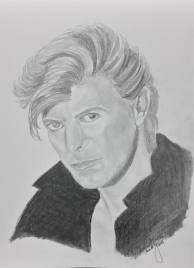
David Bowie (pencil on paper, 9″x12″, private collection)
David Bowie (pencil on paper, 9″x12″, private collection)

Commissioned work: Music is My World
16″x20″, mixed media on paper
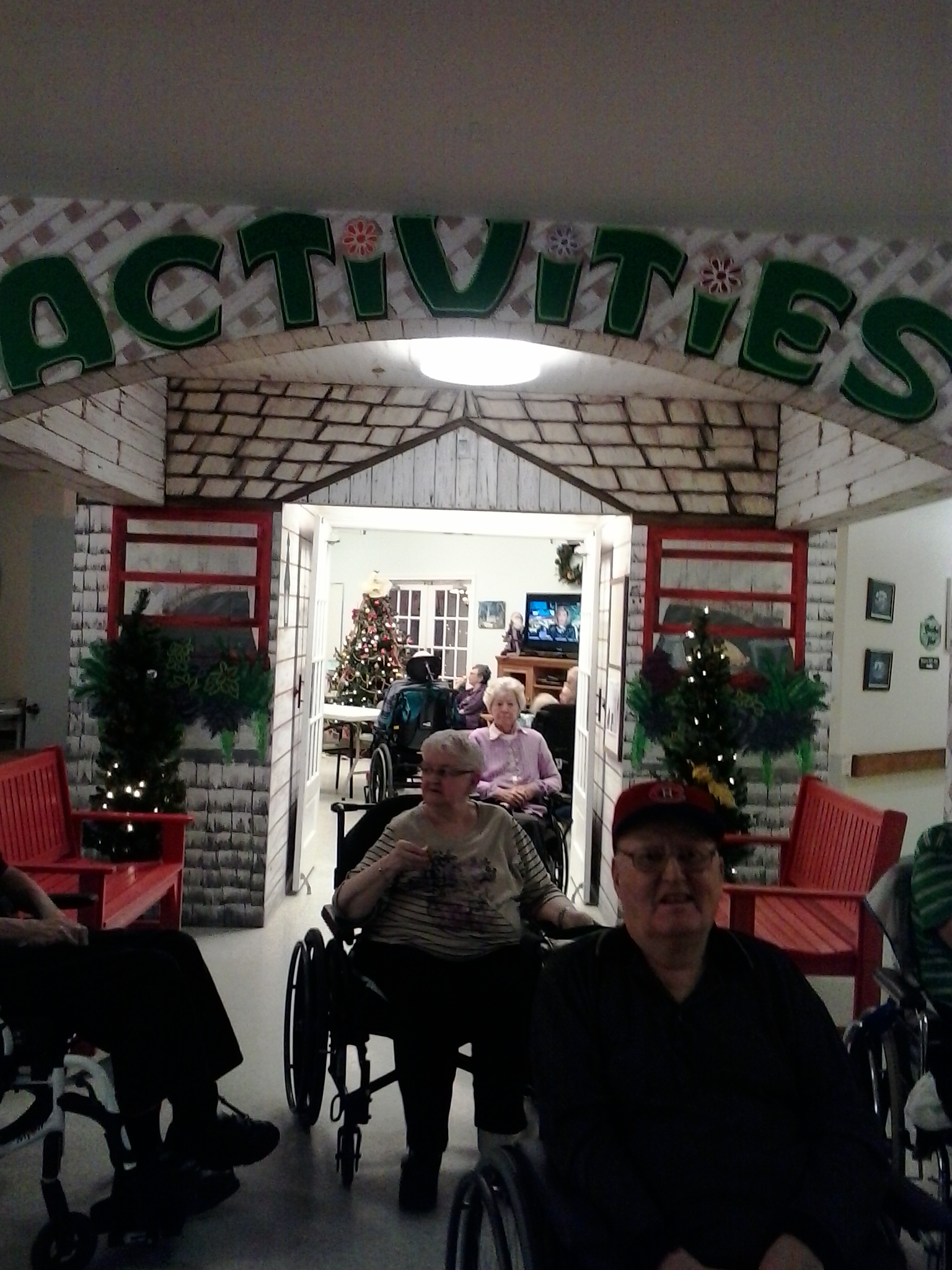
Finally took a photo on site! Taken just before Christmas 2014.
Below: Old Folks at Home Mural, with residents from the Garden Home enjoying the scene.

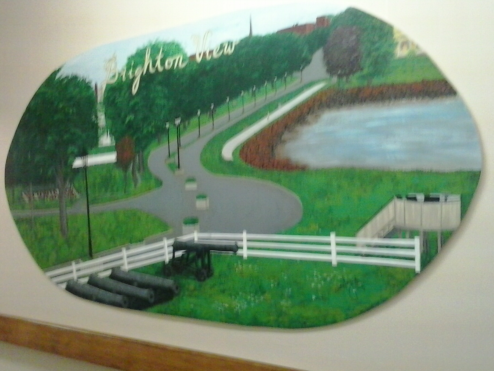
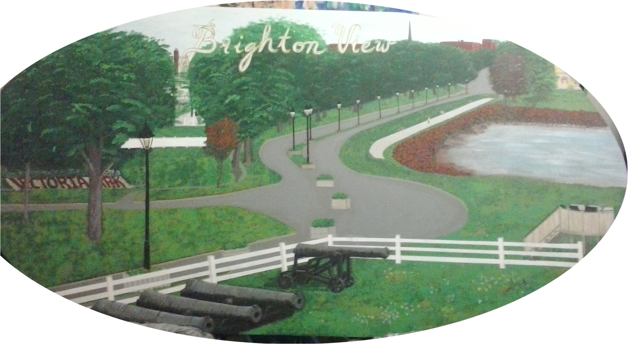
This photo is the Brighton View Landscape in sitio.
 Both works of art are on permanent display at the Garden Home on North River Road, Charlottetown, PE.
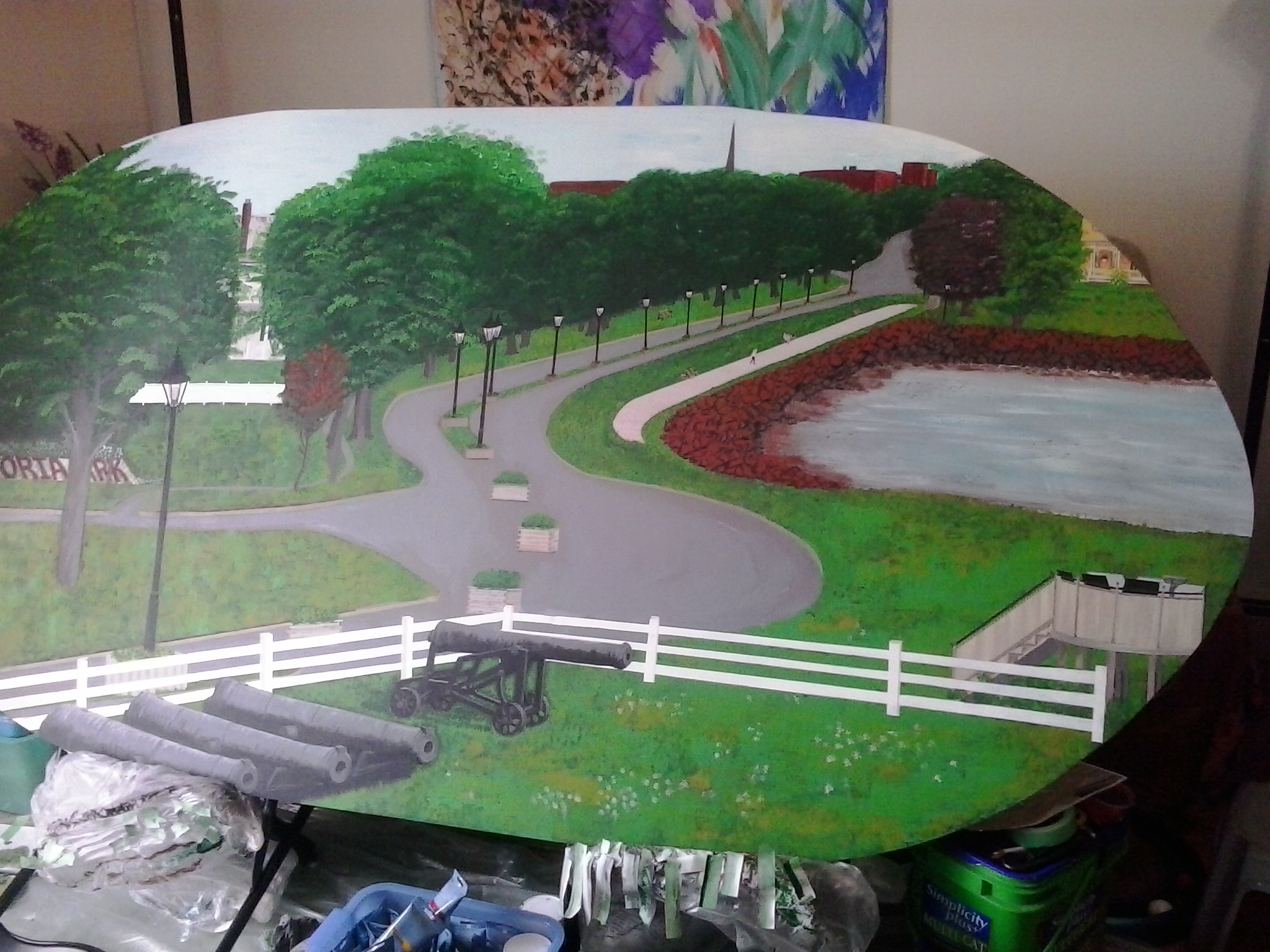
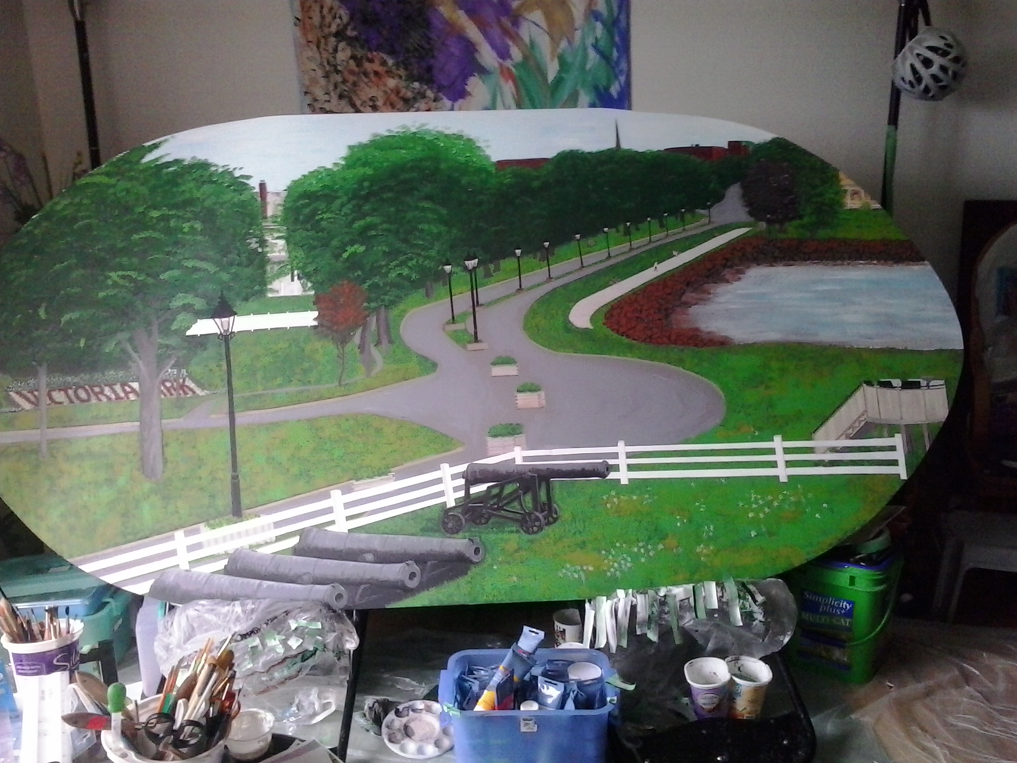
Here, in different stages, is the Brighton View Landscape painting I created for the Garden Home.
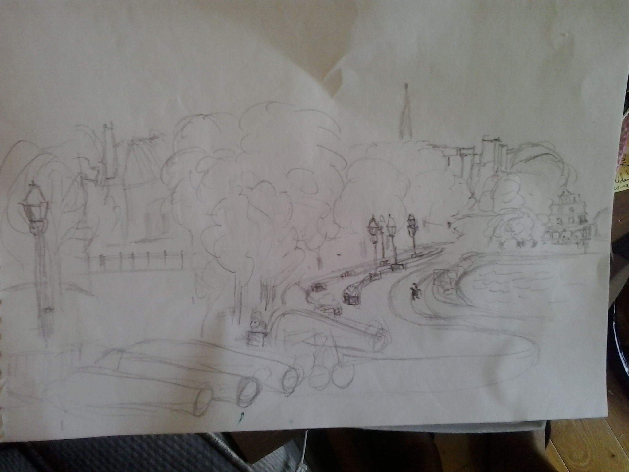
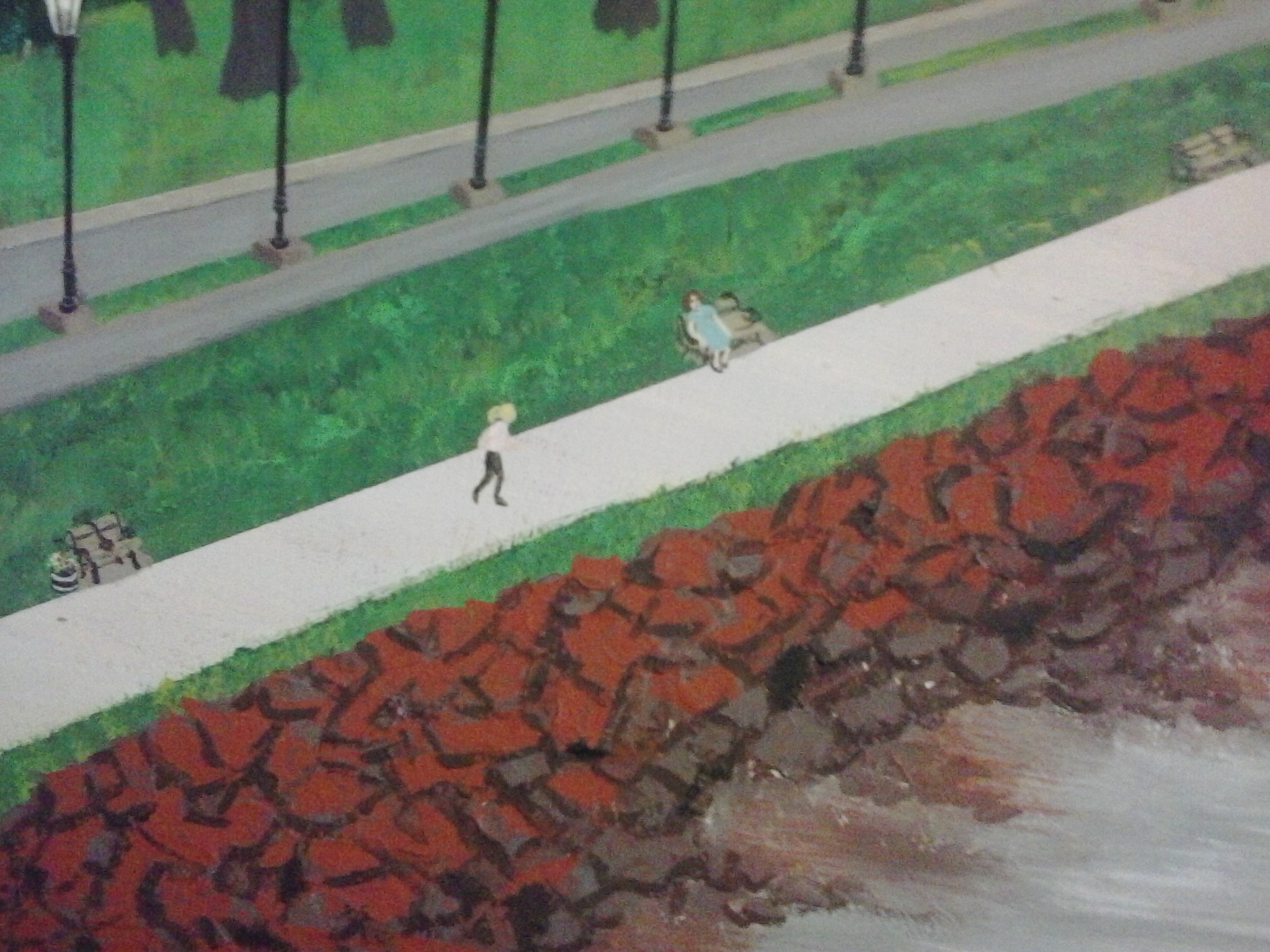
I made this rough sketch at the park before starting out. I was standing at the farther end of the enclosure of the Fort, so the view is more frontal than aerial, but when I did the painting, I shifted it so that the view would be more aerial.
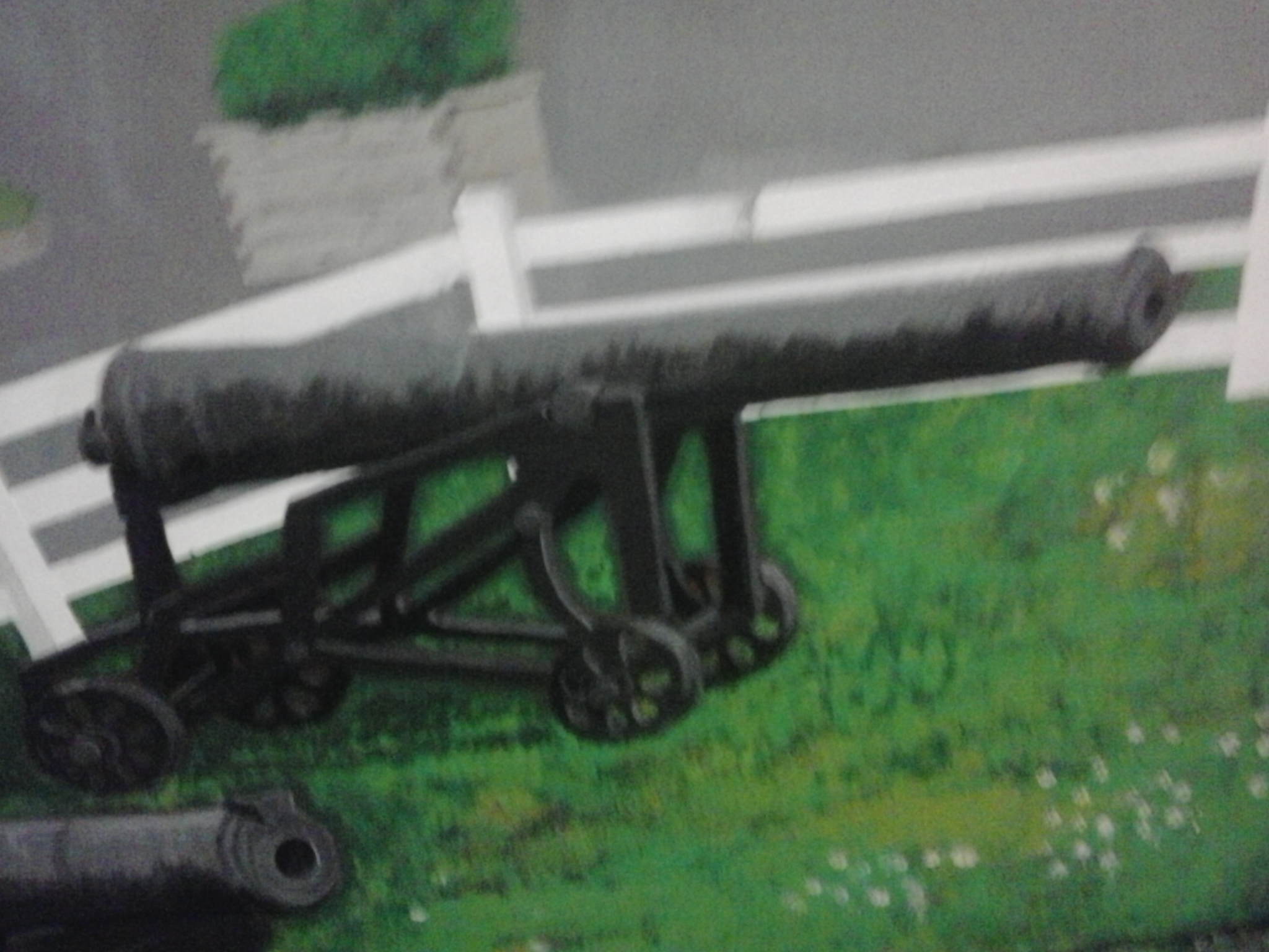
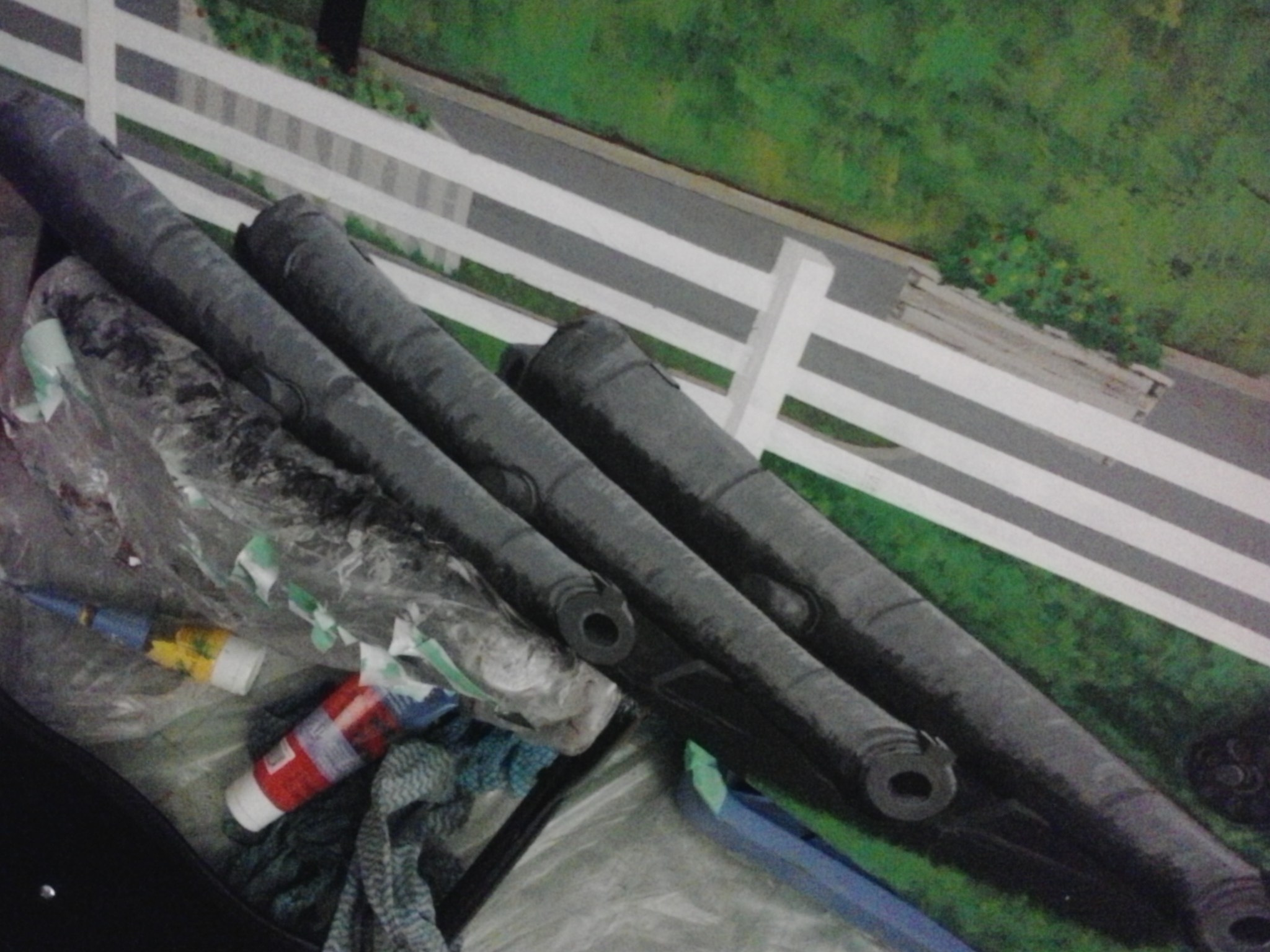
When I started out, I figured I’d make the cannons a central image, and based it on a photo I had taken with the cannons close up and forward.
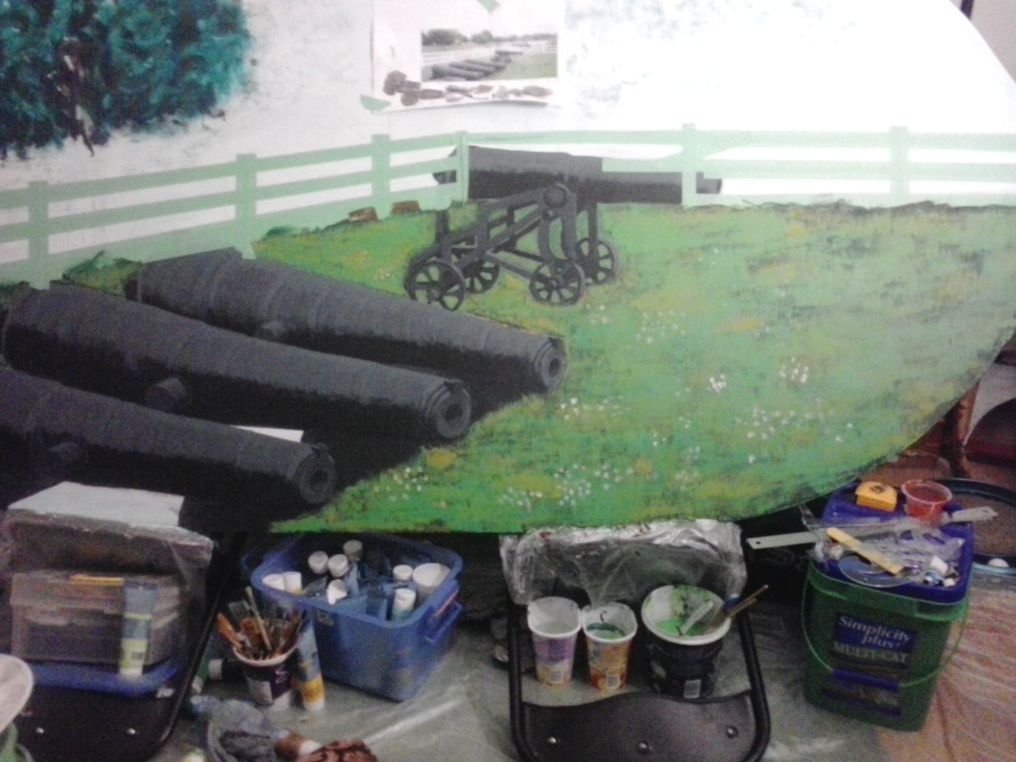
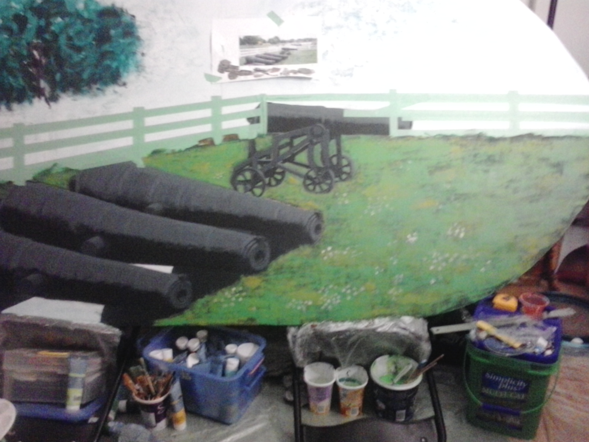
I should have gone with the preliminary sketch, which the clients really liked better, so I cleared out the large cannons and pulled out to get more of a bird’s eye view.
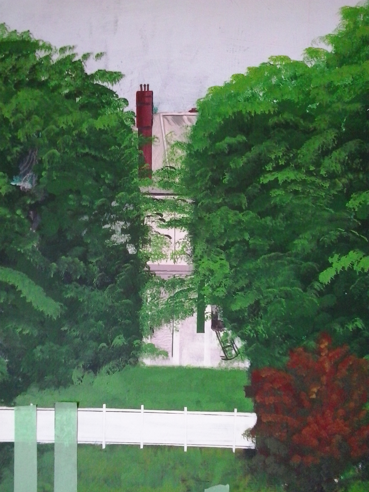
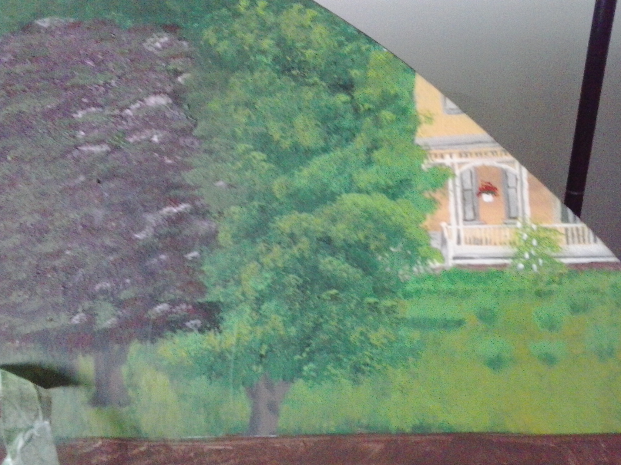
The first detail I completed was Beaconsfield House in the upper right hand corner.
the Lieutenant Governer’s Residence, Fanningbank,
which is visible between the trees from the park.
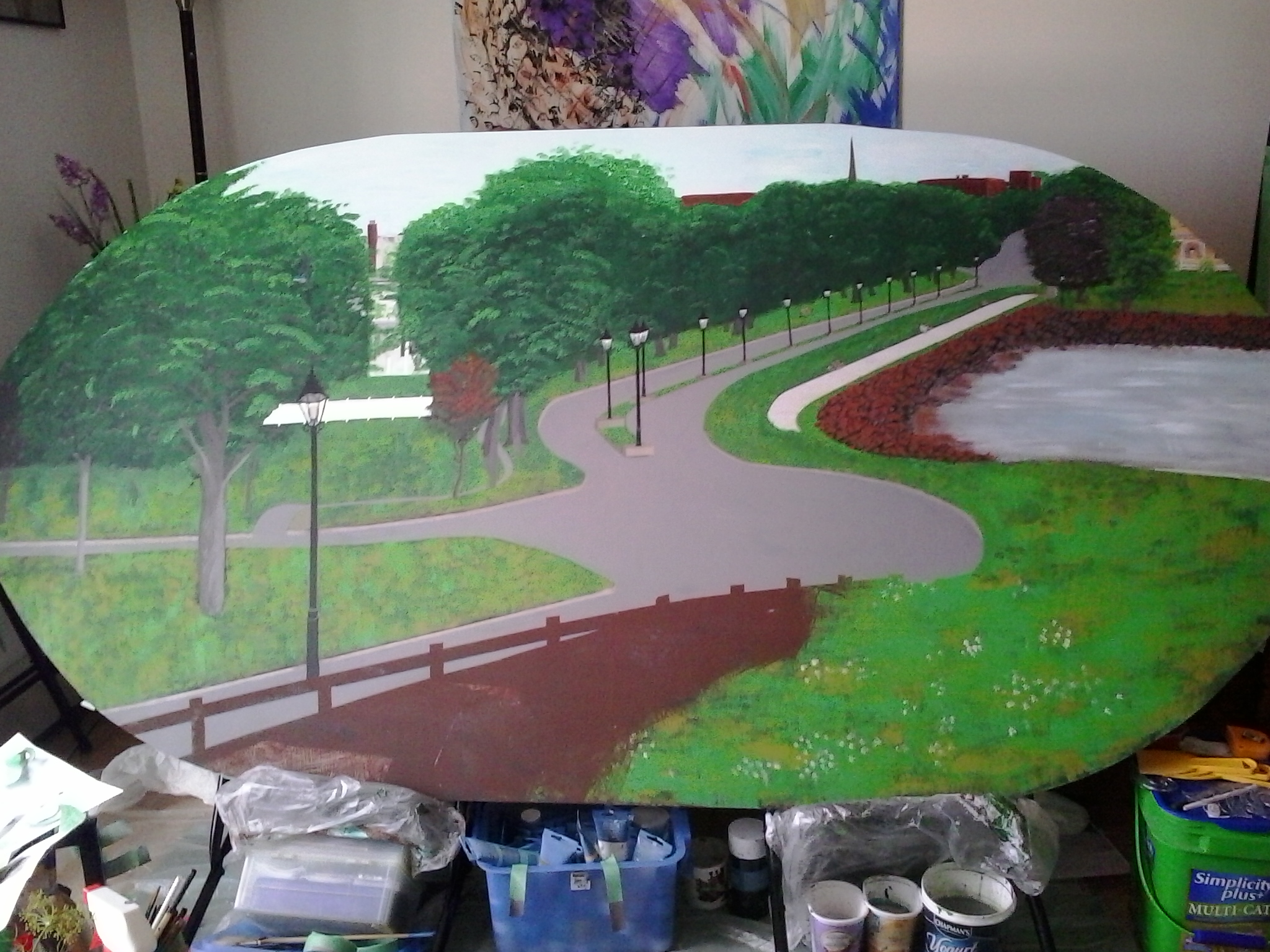
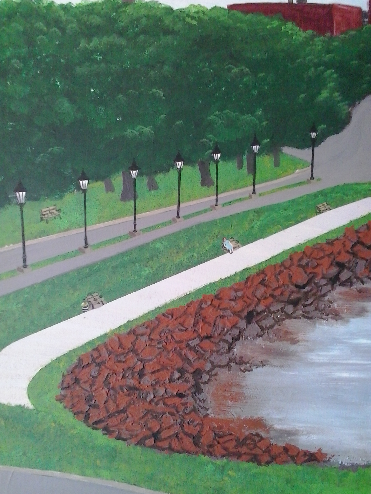
Next, I worked on the rocks around the shore of the Gulf of St. Lawrence, in the Bay that leads to the Charlottetown Harbour, also visible from the park. I added the lamps and detailed them.
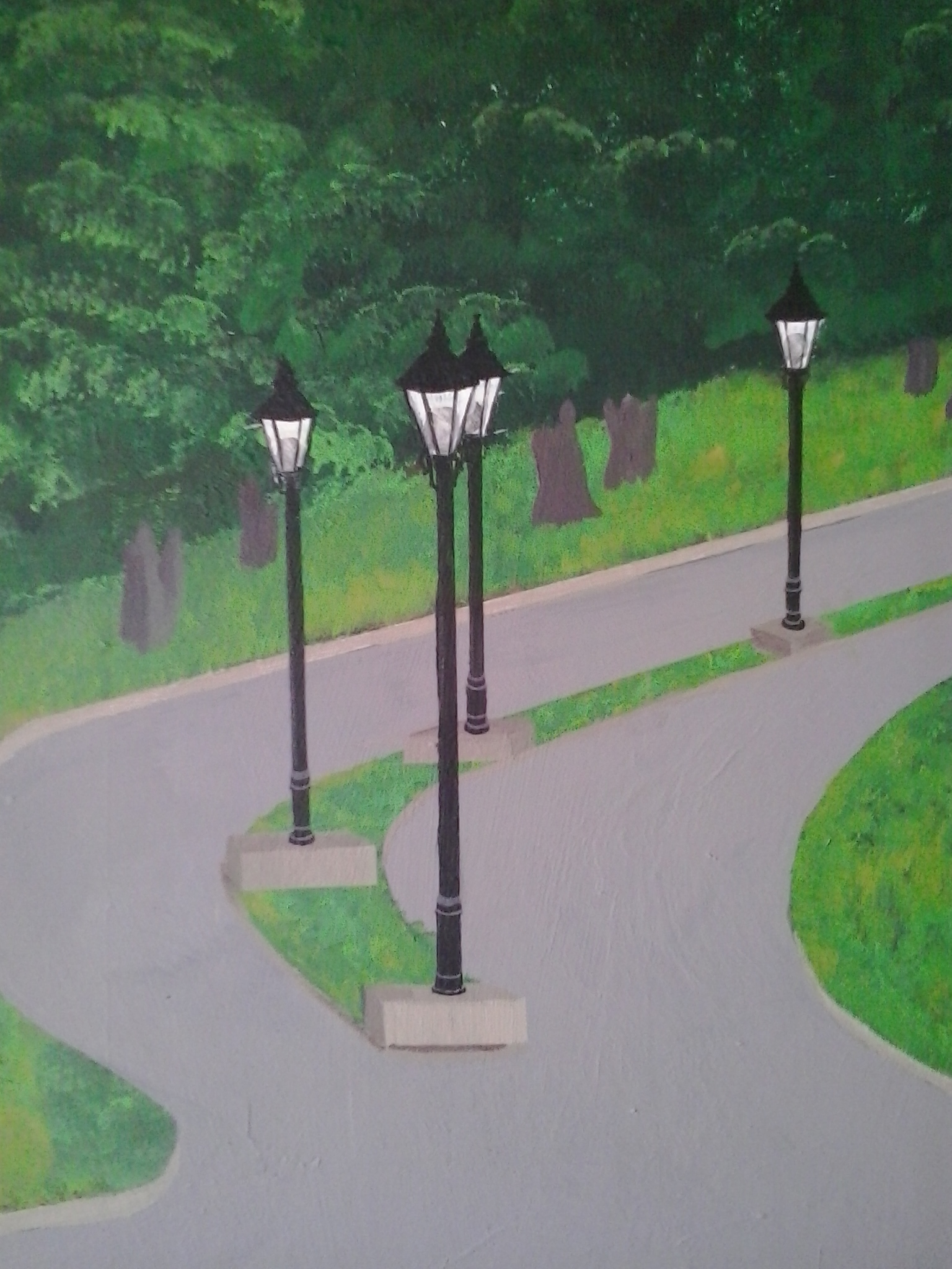
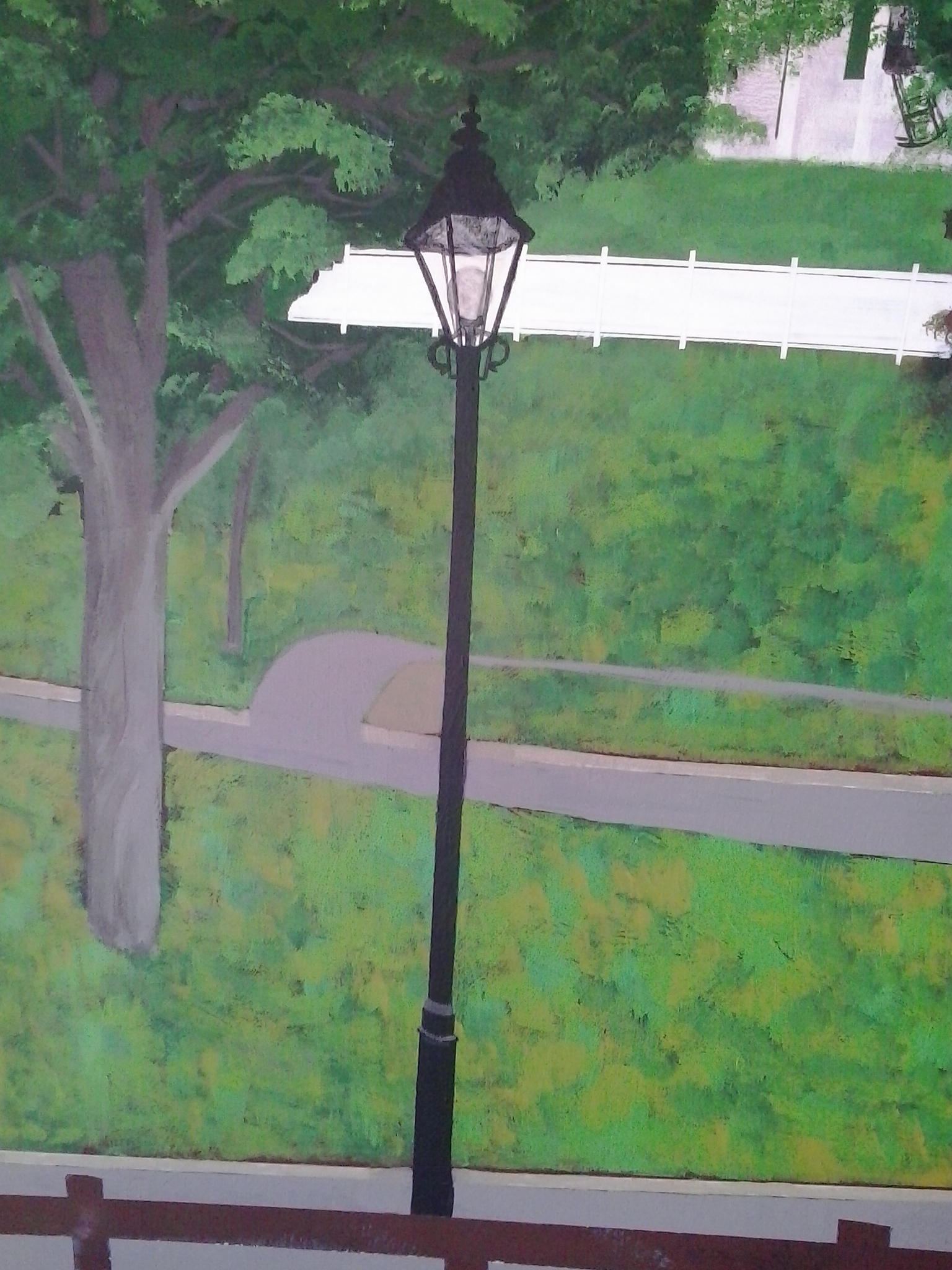
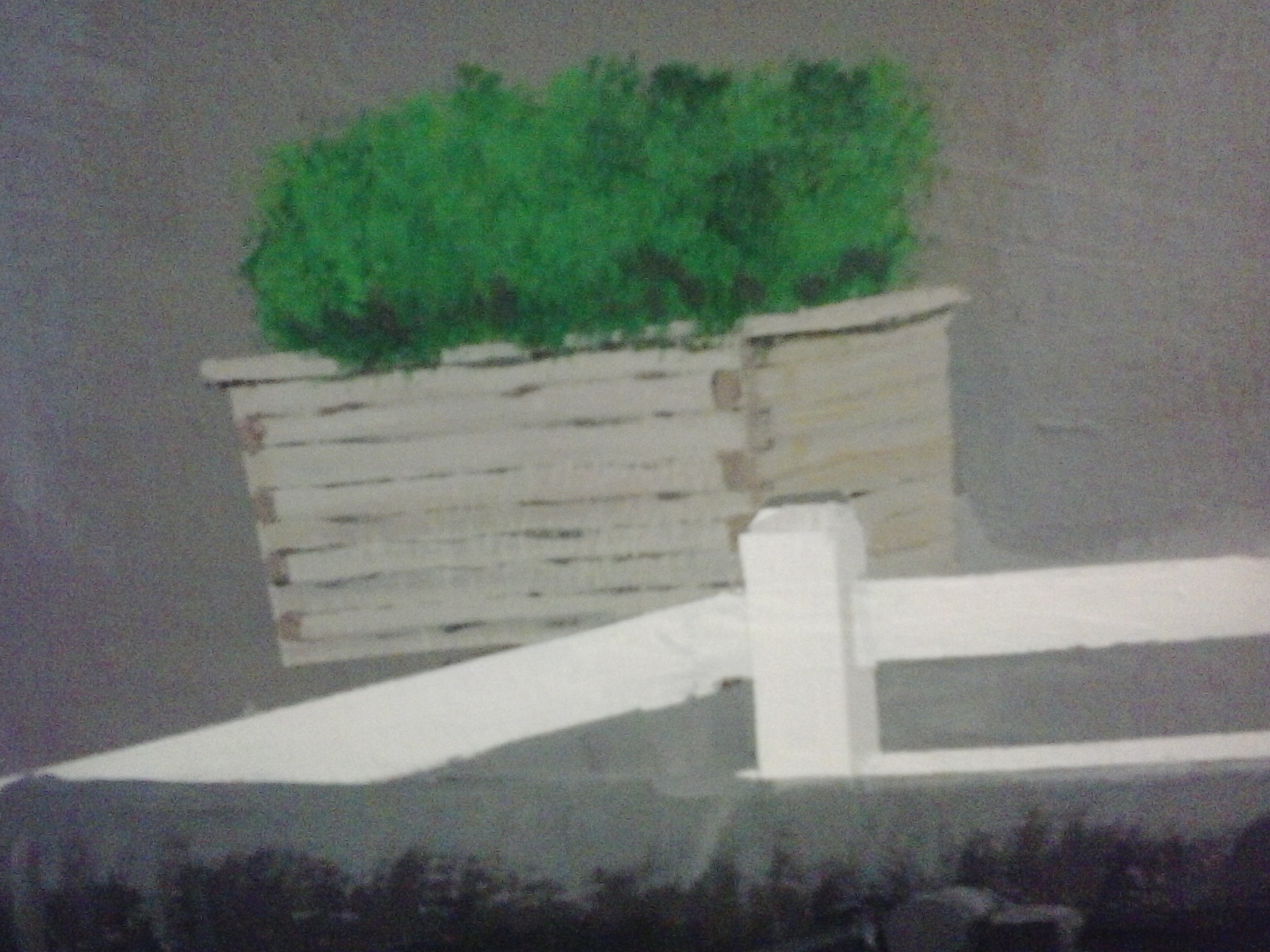
Then, I worked on the flower boxes and the planters. Each lamp had flowers at the base. I decided not to include the planters that were used during summer to divide the left lane in two so that there would be a bicycle lane, because it would make the road too crowded and the lanes too narrow.


Then I started on the new cannons, much smaller and placed in the bottom third of the painting, instead of in the bottom half.
 I changed the proportions a bit, so they look longer and thinner up close, but fit nicely in the bottom; I also changed some of the proportions of the fence so I could fit the cannons into the bottom third, so you get more of a view from up looking down.


After the cannons, I added more details to the boardwalk–worked on the park benches and a seated woman. Then, when my friends Veronika and her daughter Viola were with me painting as well, I added a jogger so Viola would have her mom in the painting!
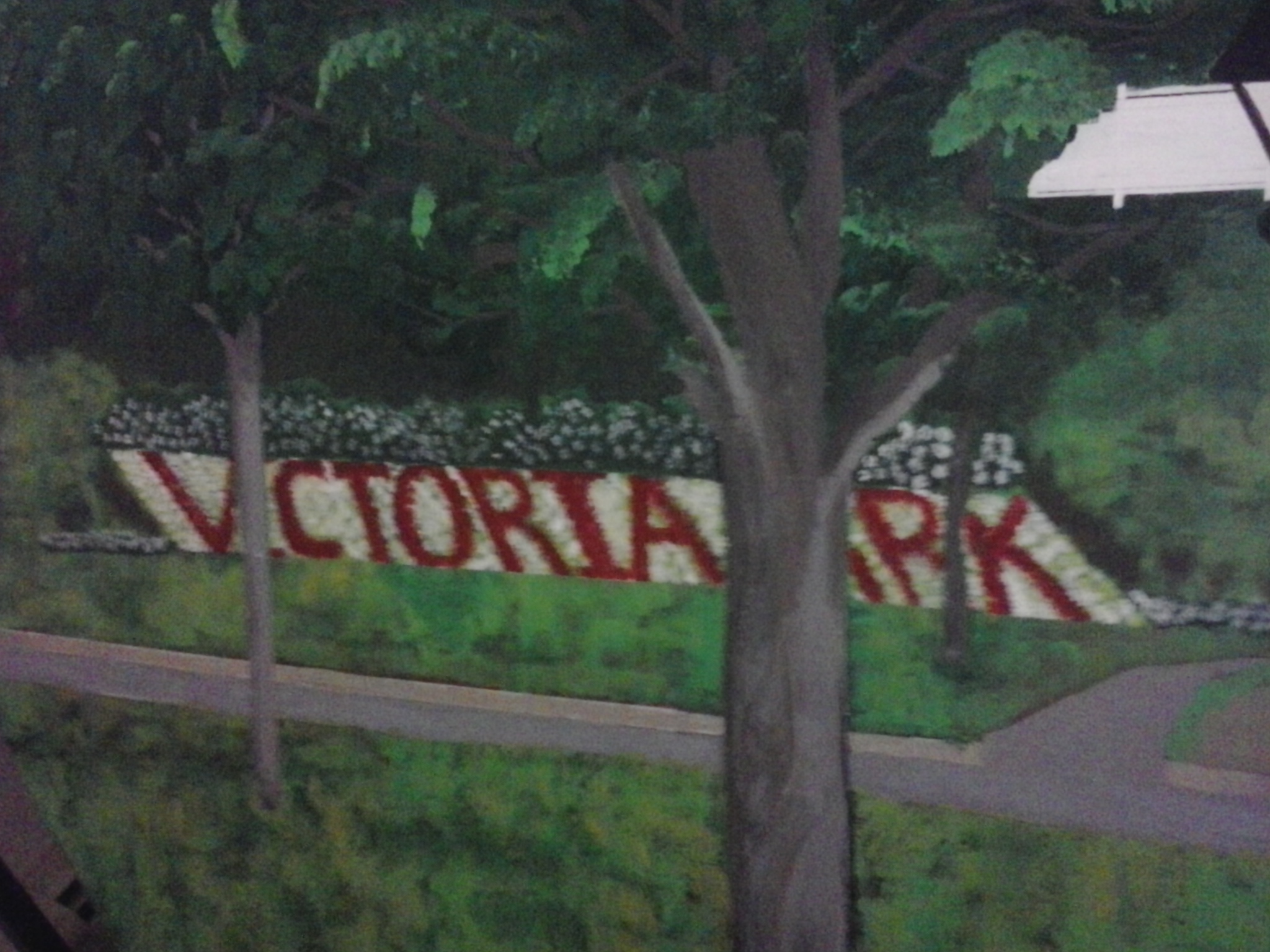
The first time I did the lettering for Victoria Park in flowers, it was too upright, so I re-did that.

Then, I did the viewing platform, added plants and flowers to the lamp post bases…

This is the blurry shot of the viewing platform in the making, but clearer than the first one I took…
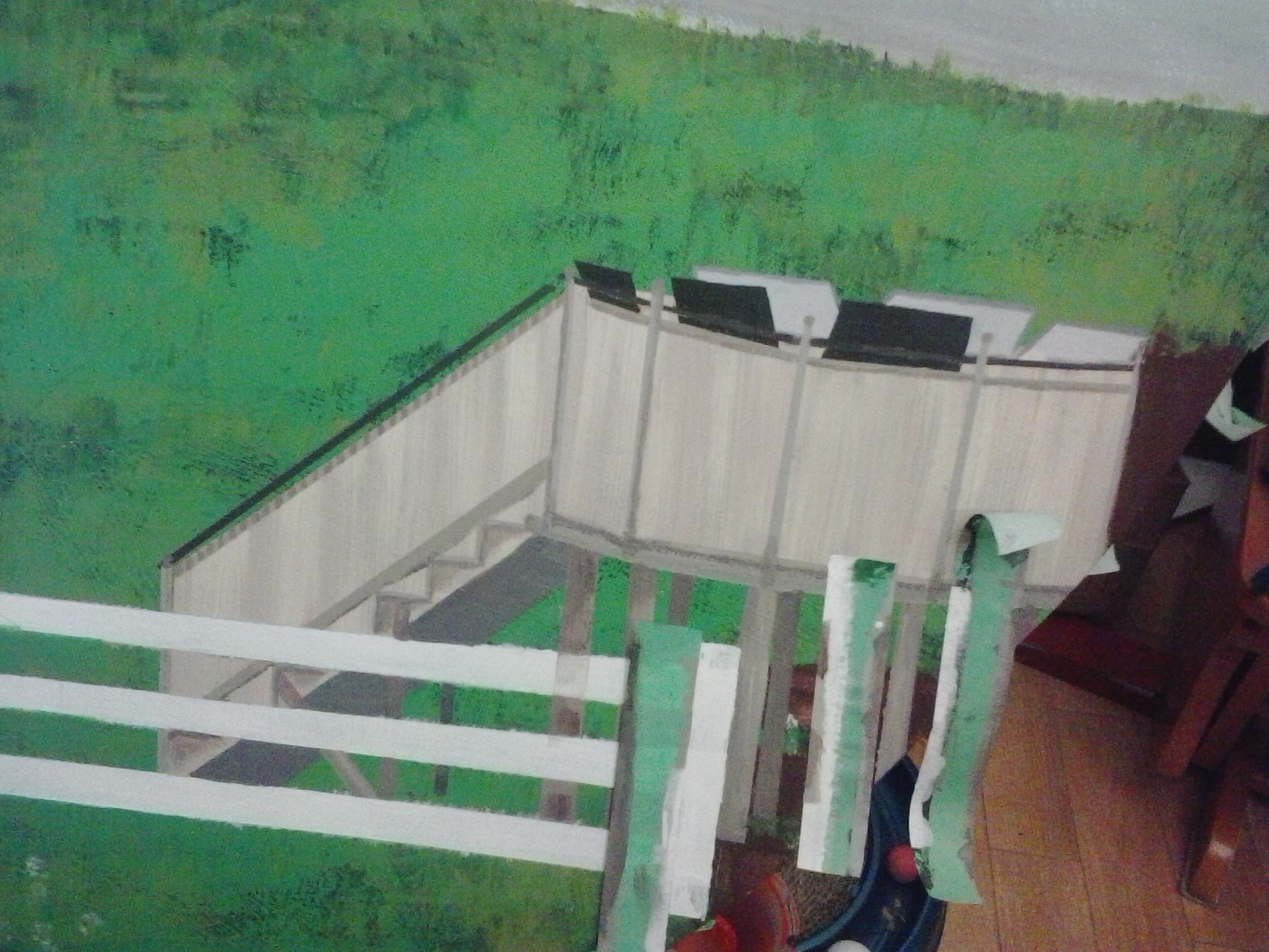
This is the clearest shot of the three I took of the viewing platform in progress…
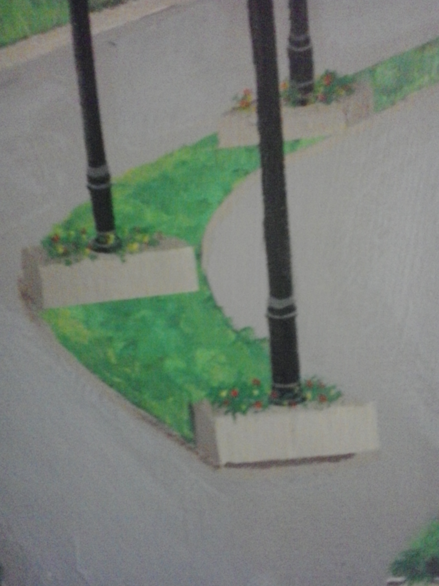
Added plants and flowers to the bases of the lamp posts…
And one day, it was just done. I roughed up the water a little, broke up some of the rocks, then let it sit for a couple of days before spraying a finishing coat.
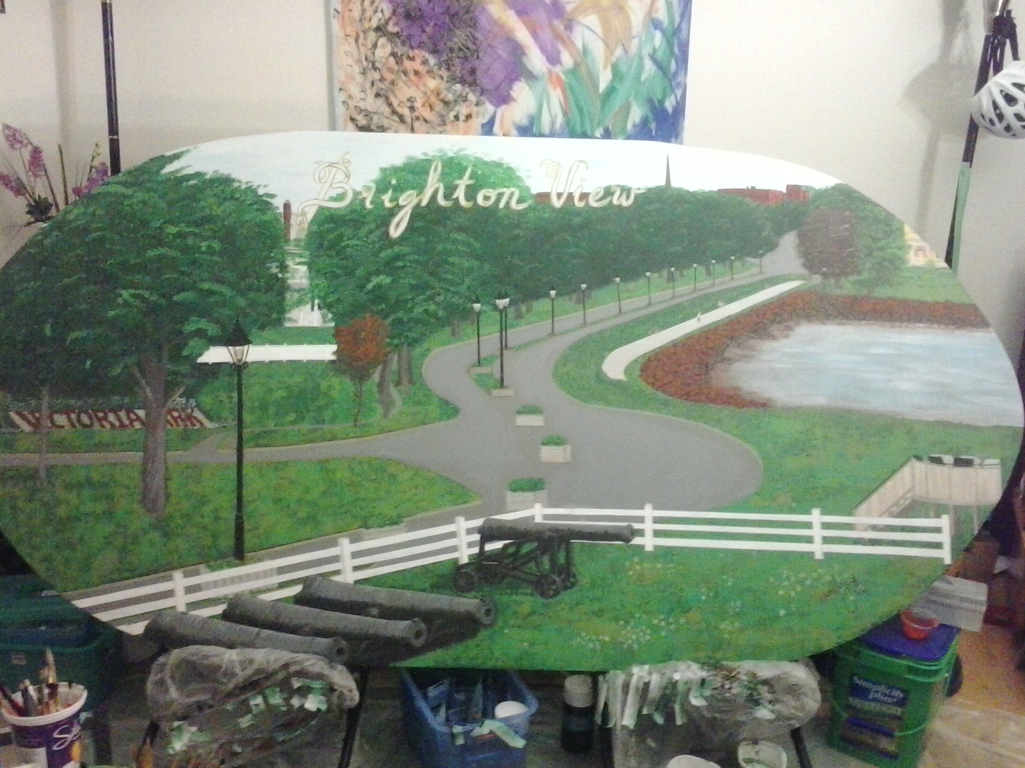
I let it sit again for a couple of days before I decided how to do the lettering in parchment with gold outlining.
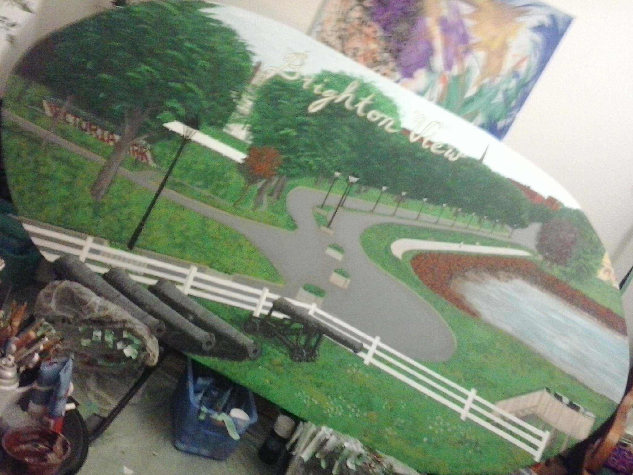
Tried to get a diagonal shot to get the whole painting into my phone view with the biggest possible shot.
The whole painting is too large to take a close-up of, so I had to pull back halfway across the living room to take a full-width view. The actual shape is elliptical…
Not enough back-up room. Hehe. It gets cropped on one side.
… and this is what it would look like if it were cropped into a perfect oval shape (which just didn’t happen when Peter was cutting it up with his jigsaw. If the clients want to trim the corners, that’s perfectly all right with me, but I deliberately made a wider ellipse to get as much painting surface as possible.
The Brighton View Landscape can be viewed at the Garden Home, North River Road, Charlottetown, along with my mural of the old farmhouse. I need to take a photo of this with a real camera with proper lighting.
Also known as the Law Building or the Public Archives Building
A good-sized crowd gathered at the small town market gallery after the closing of the Charlottetown Farmer’s Market on the 29th of March to listen to Lunenberg, Nova Scotia artist Andrew Maize talk about his new marker drawing series.
Maize, who decided art was his calling as a teenager, after seeing a video of Jackson Pollock at work, has been experimenting with creating art from found materials for several years. He believes that “there is a lot of potential in found materials” and is always considering how such materials can be used in different ways. His current exhibit is testament to this philosophy. He has been collecting used markers and using them in unusual ways to create art.
On display until the 17th of May, his latest Chartpak Marker Drawings Series is a series of 12 “drawings”—his interpretation of drawing the ink out of used markers by standing them tip down on a pile of highly fibrous paper and letting gravity do its work by making the marker ink leak onto the paper and seep through the layers for 3.5 hours. The markers were arranged in random order in the same box they came in.
What is interesting about this work, is how each marker stain finds its space on each sheet and how some stains are completely ‘spaced out’ while others take on larger or different forms. Each sheet shows the slightest transformation so that they are almost the same from one to the next, but are quite different two or more sheets away. It makes me think of an exercise used in analyzing how a message changes with each transfer. In most cases, messages are distorted one or two words at a time until the end message can be completely different from the original. In the same way, the original “drawing” is completely different from the final one in Maize’s series.
Another point Maize brought up was how, no matter how useless or invaluable the found materials are, once they are transformed into art, they attain a certain value that makes the artwork precious, at the very least, to the artist. It was probably by serendipity that the choice of mounting (bulldog clips and string in the upper corners of the drawings) emphasized the fragility and vulnerability of the works in their unusual gallery setting, which in turn highlighted how delicate and precious they were. Certainly, this must be an attachment all artists acquire with their works, especially when they have been completed, and Andrew’s experimental art shows how much value can be generated by the creation of art from things other people normally discard.

###
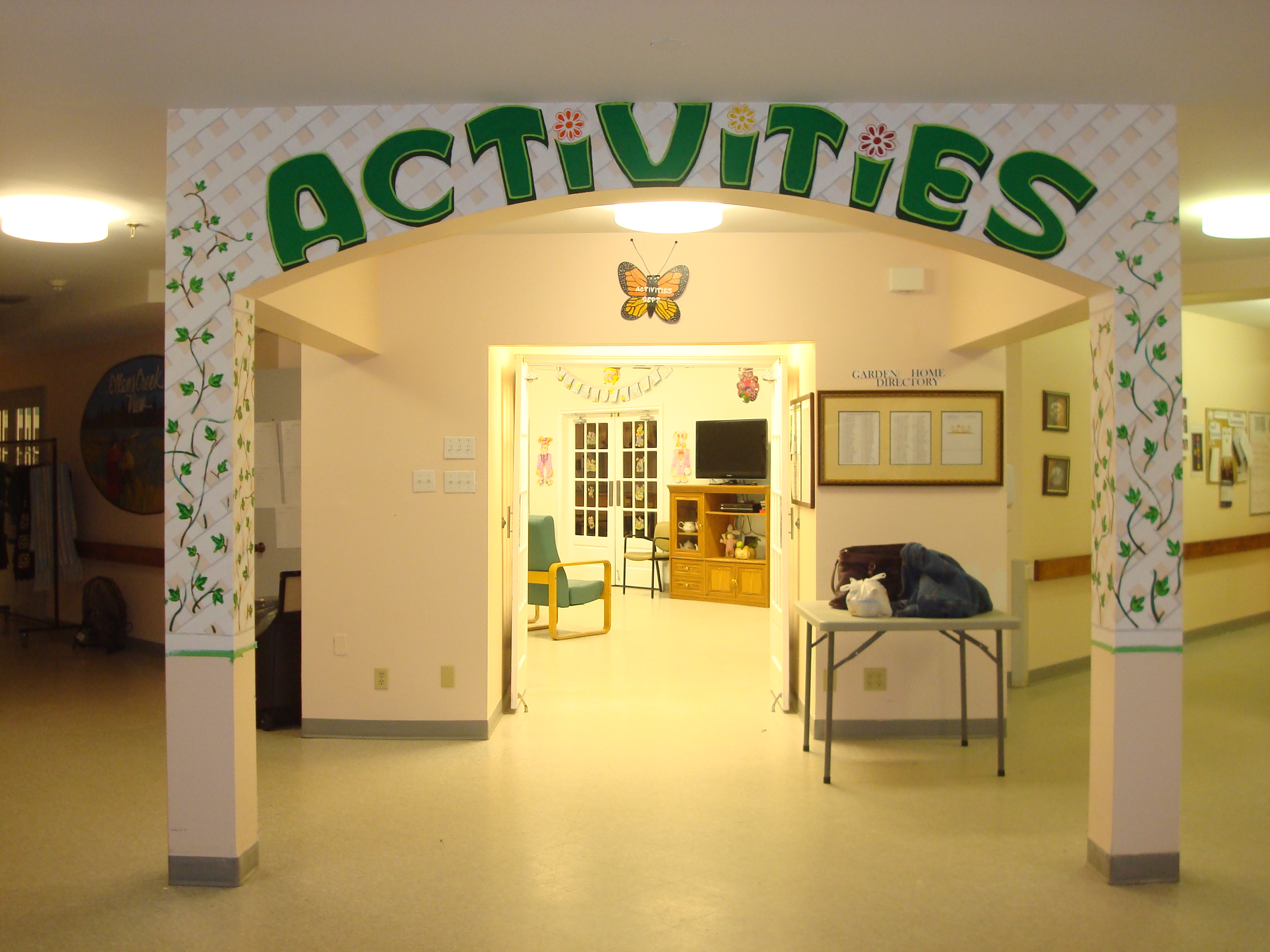
I started this on a bare surface. Because of the rigid lines for the letters and latticework, I decided to mark off the grids and outline the letters. Everything after that was done freehand. Everything after this will be done freehand.
I was really excited to start this project, as were my contacts at the Garden Home, in particular, Angela, who is in charge of special projects. She gave me an idea of what she wanted and I presented her with sketches, designs, lettering, and colour options. The first day, I put in the dark green colour, which received some objections, as well as the fact that the size of letters was too big, but Angela wanted them big and eye-catching, so I delivered on that. To improve on the letters, I added an emerald green center and created an outline with green yellow to make the letters look more solid as well stand out more. Then, I created the latticework in white, which everyone really liked. (see Day 2). When I started putting in the shadow to make the latticework look solid, Everyone just liked it better! When I started to put in the vines crawling in and out of the latticework, my audience stayed till bedtime.
So far, I’ve been enjoying my days painting this, and am truly glad that it is bringing joy and gladness to the residents and staff as well. Today, I take a break as there is a powerful storm blowing over the island and everyone is staying home. I am hunkered down in front of the TV with my faithful Caliban on my lap, my laundry in the dry cycle, and hot chocolate ready to make.
Next step is finishing touches on the leaves, including shadowing, and a little more shadowing on the latticework.
Nature didn’t take shortcuts to decorate each and every leaf.

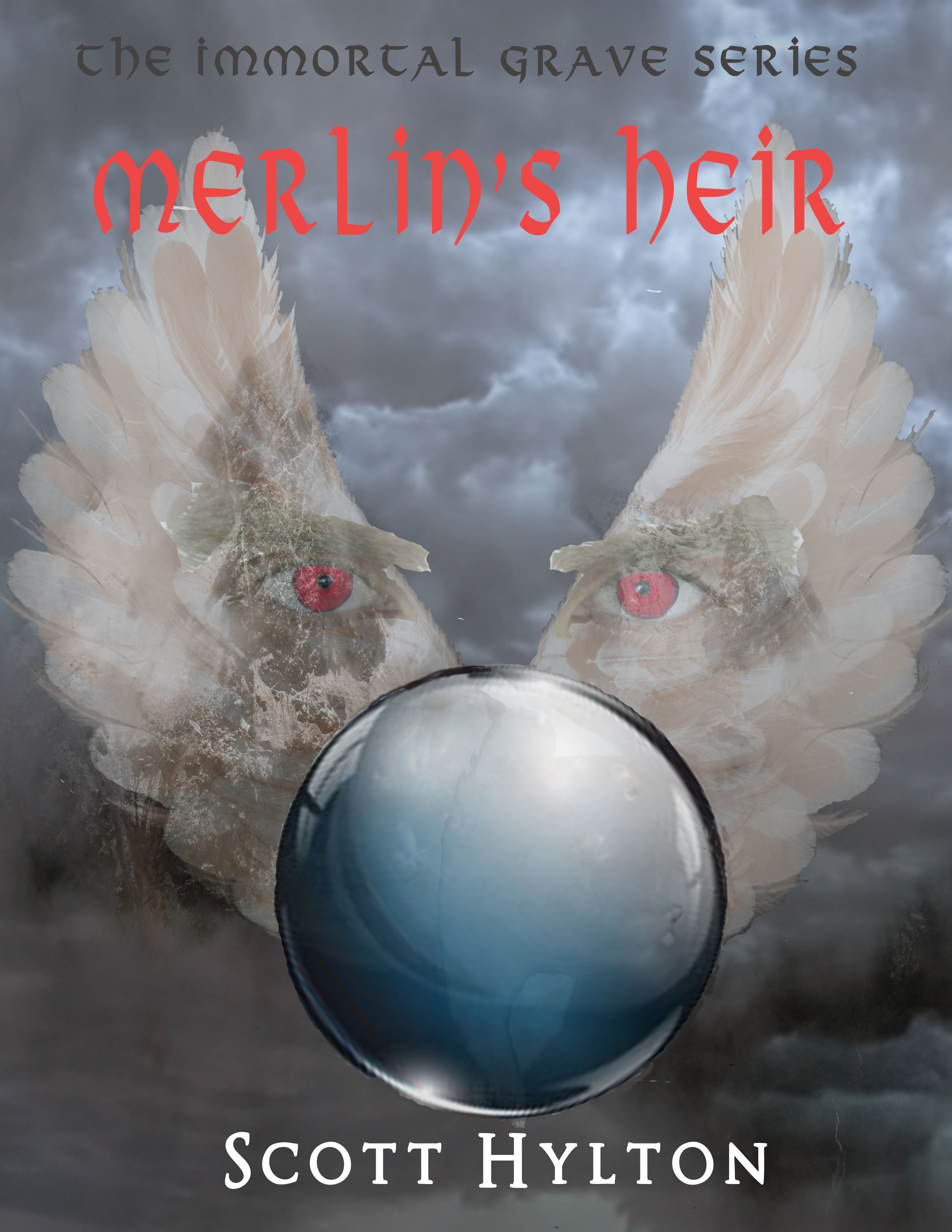
I designed this book cover for a friend!
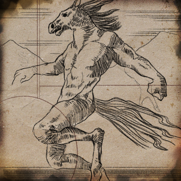
*Artwork by my son Kitt Lapeña. Originally created for an online TV Feature article by my niece, Carmela Guanzon Lapeña, reporting for GMA News Live.
The creature stopped in the center of the clearing and stretched itself to its full height, as far as its bent legs would allow. Its head grazed the lower branches of the banyan tree where Lubid was hiding. Benjamin’s breath caught in his throat and he could sense Talón tensing beside him. The creature raised its head to the waning moon and whinnied, then slowly turned around in a circle and began what seemed like a very ritualistic dance, snorting and whinnying as it did.
~Excerpt from The Lost Amulets by C.P. Lapeña

