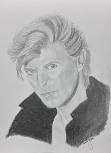
David Bowie (pencil on paper, 9″x12″, private collection)
David Bowie (pencil on paper, 9″x12″, private collection)
This commission is the restoration and painting of a 4-foot high statue of Our Lady of Lourdes that was recovered from a garbage bin.
 I was determined to document the whole project with lots of photographs because I always forget to document what I do. This time, I made sure I had lots of photographs, especially since this would be quite a challenge. I took several photographs from different angles. The photo on the left is from the rear, right.
T he next photo to the right show the back, which was rough, dirty, and had several chips and chunks broken from the cape. A rusty pipe also stuck out from the back, most likely an attachment to a fountain. The pipe had to be sawed off, which also took off a tiny chunk more of concrete, but it didn’t make anything worse than it already was.
The photo below shows the left side of the statue, w here you can see a large crack under the left arm. The photo to the right show the full front.

This close-up of the face shows chips on the nose, the corroded front, and hollowed-out eyeballs.

The photo on the right shows how corroded the base is. This is from the left side of the statue.

The rear bottom of the statue had a hole where the pipe exited; there were bits of rusted metal inside, most of which I was able to pry away. This is worrisome because there’s no telling how much mold and mildew was inside the statue itself.
Panning out a little in the next photo, you can see the chipped cape and pockmarks, most probably from mold as well as pieces of granite falling out from the concrete. 

This close-up of the back shows more cracks across the shoulders and where the pipe came out–about 2 inches of it protruding from the back. There are also cracks across the lower part and several chips out of the folds of the cape, as seen below as well.


August 16, 2016: This is the statue after it had been scrubbed and hosed down. In its original state, it was cracked, moldy, and had layers of old paint. The first phase would involve removing all the loose paint and cleaning out chips and cracks, and smoothening the surface so there would be as little difference as possible between the original surface and the surface where the old paint would not come off.
August 21, 2016: The next stage involved patching up the statue: repairing chips, filling in holes and cracks, and smoothing the roughest parts. This included a little “nose job” as well! I preferred to use my fingers to fill in the cracks with a nice spackle that promised not to expand or shrink. This was important because the statue is going to be put outdoors and expanding or shrinking of the filler could compromise the statue and create worse problems in the future. I’m hoping the product is true to its claim! After the cracks and holes were filled, I applied a sealant to make sure no moisture would get into the really fine cracks and holes left from concrete and granite separation.


August 28, 2016: Finally, the actual painting work could begin! I started with a good primer.

After the primer, I painted the whole statue white, then applied the base skin color to the face, neck hands, and feet.


The next biggest swath of color was the blue cape and the sash. I selected a lovely sky blue color for this. I deepened the shadows in the folds of the cape with a bit of purple.

Then, I decided to work on the base next, painting in the roses on the feet, leaves, branches, and the rock.


The final touch for the day was a tinge of pink on the cheeks and shaping the lips with the same tinge.

I planned to work the whole weekend, but the weather was damp and rainy, so I never got to return to the statue that weekend. I finally got back to it the next weekend, which, thankfully, had lovely sunny weather.
September 3, 2016: I worked on details. I started with the face, working on the mouth because that would be the easiest. Then I worked on the eyes, starting with an outline and layering on the white, the pink flesh inside and around the whites, a brown cornea, black for the iris, then the most delicate lines on the cornea with black, white light spots, eyelashes, and the eyebrows. I also added shadows to the face, neck, hands, and feet, then did the fingernails and toenails as well. I used brown on the rosary to simulate wooden beads. Finally, I applied a gold trim on the veil and cape as well as a touch of gold thread/trim on her collar and cuffs. I even touched the cornea with a few very fine gold lines to make them look more real. At the end of the day, I sprayed the whole statue with a layer of non-yellowing transparent matte overcoat.


September 4, 2016: I returned to the statue for finishing touches, retouching spots where there was white on blue or blue on white, brown on flesh, touching up the shadows, cleaning up edges of lines, before the final couple more layers of finish. I wish there was more light from the back so you could see details of the cape, especially where there were chips and chunks gone from it.


The statue will go to St. Francis Church in Cornwall, Prince Edward Island, where I hope they will take good care of her. I have given instructions for them to apply a couple of coats of spray-on finish once a year to preserve the colors.
It’s so satisfying to complete a project and see it turn out so well! I’m always sorry to finally finish a job, but also glad that each commission I complete opens up doors to more similarly satisfying jobs. It’s work I would not mind doing for the rest of my life! The biggest challenge with this project was the restoration first, then working with the rough concrete surface. And then the worries about how the face would turn out and if I could do justice to the subject.I could tell it had a lovely face from the start and I was excited to see what I could do with such a damaged statue. I’m really happy with the finished work.
###
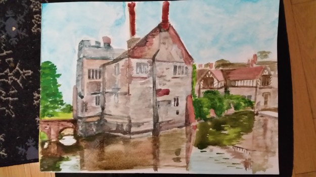
I did this watercolour today for the WetCanvas.com November challenge. The subject is Baddesly Clinston Manor in Warwickshire, from a reference photo from Google Street View provided by the group’s administrators. http://goo.gl/maps/TjvfL
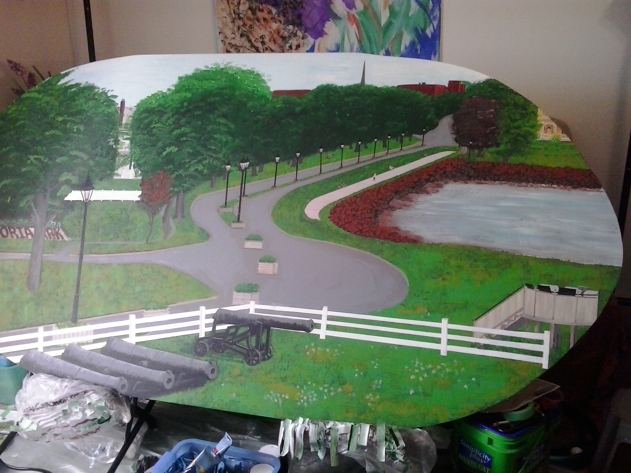
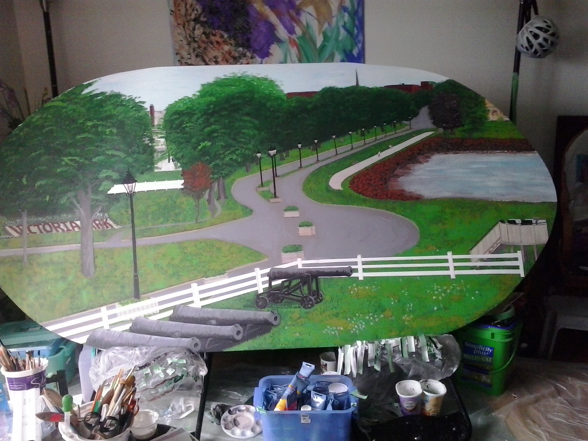
Here, in different stages, is the Brighton View Landscape painting I created for the Garden Home.
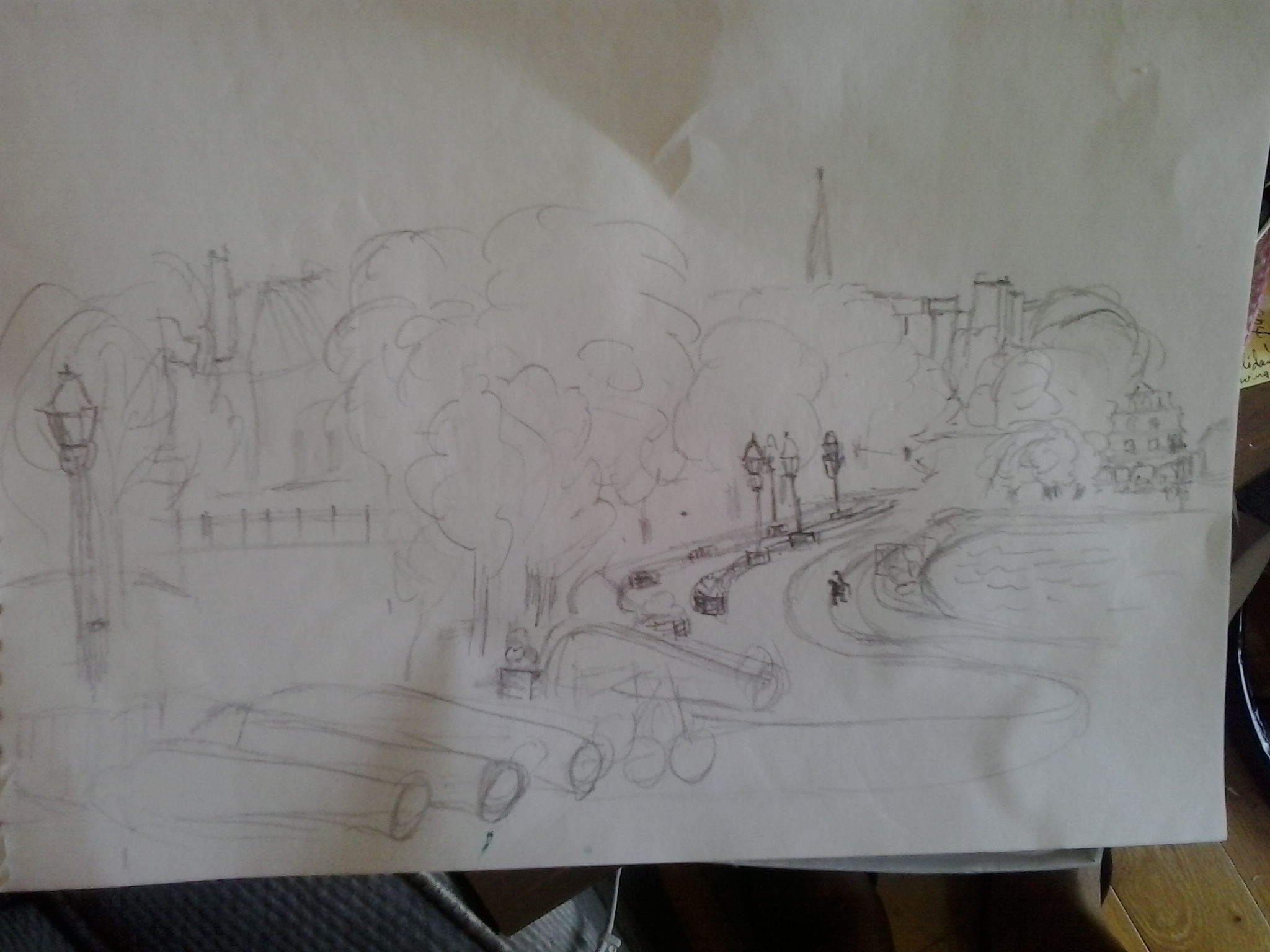
I made this rough sketch at the park before starting out. I was standing at the farther end of the enclosure of the Fort, so the view is more frontal than aerial, but when I did the painting, I shifted it so that the view would be more aerial.
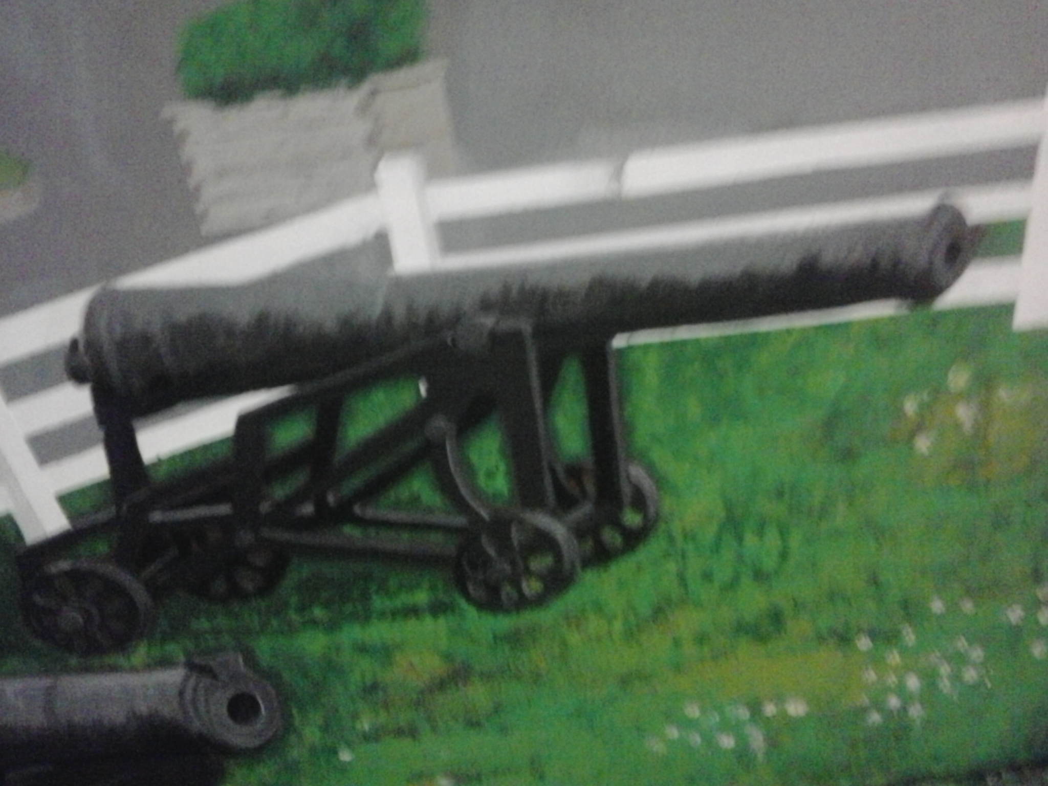
When I started out, I figured I’d make the cannons a central image, and based it on a photo I had taken with the cannons close up and forward.
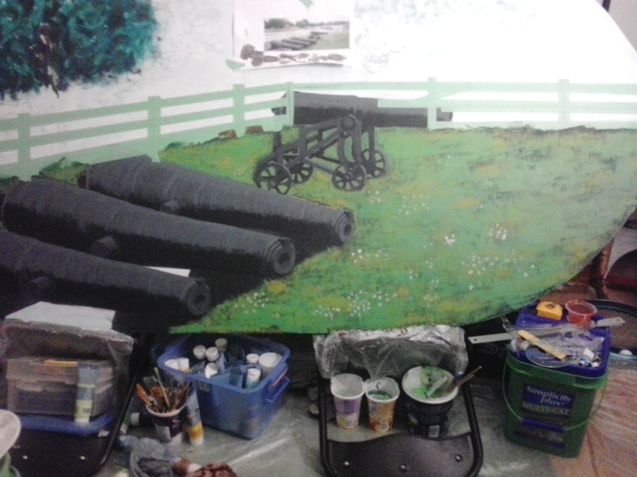
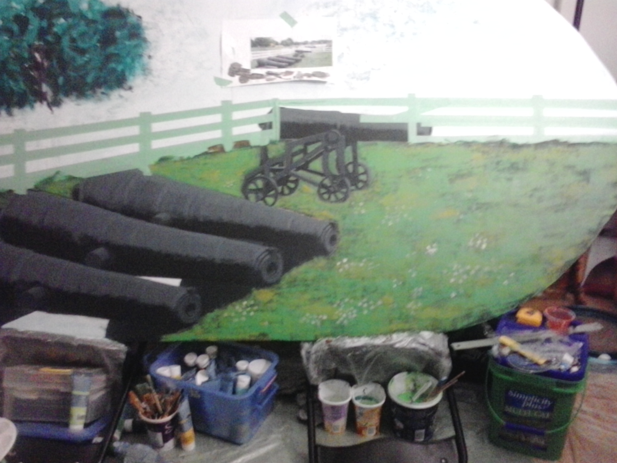
I should have gone with the preliminary sketch, which the clients really liked better, so I cleared out the large cannons and pulled out to get more of a bird’s eye view.
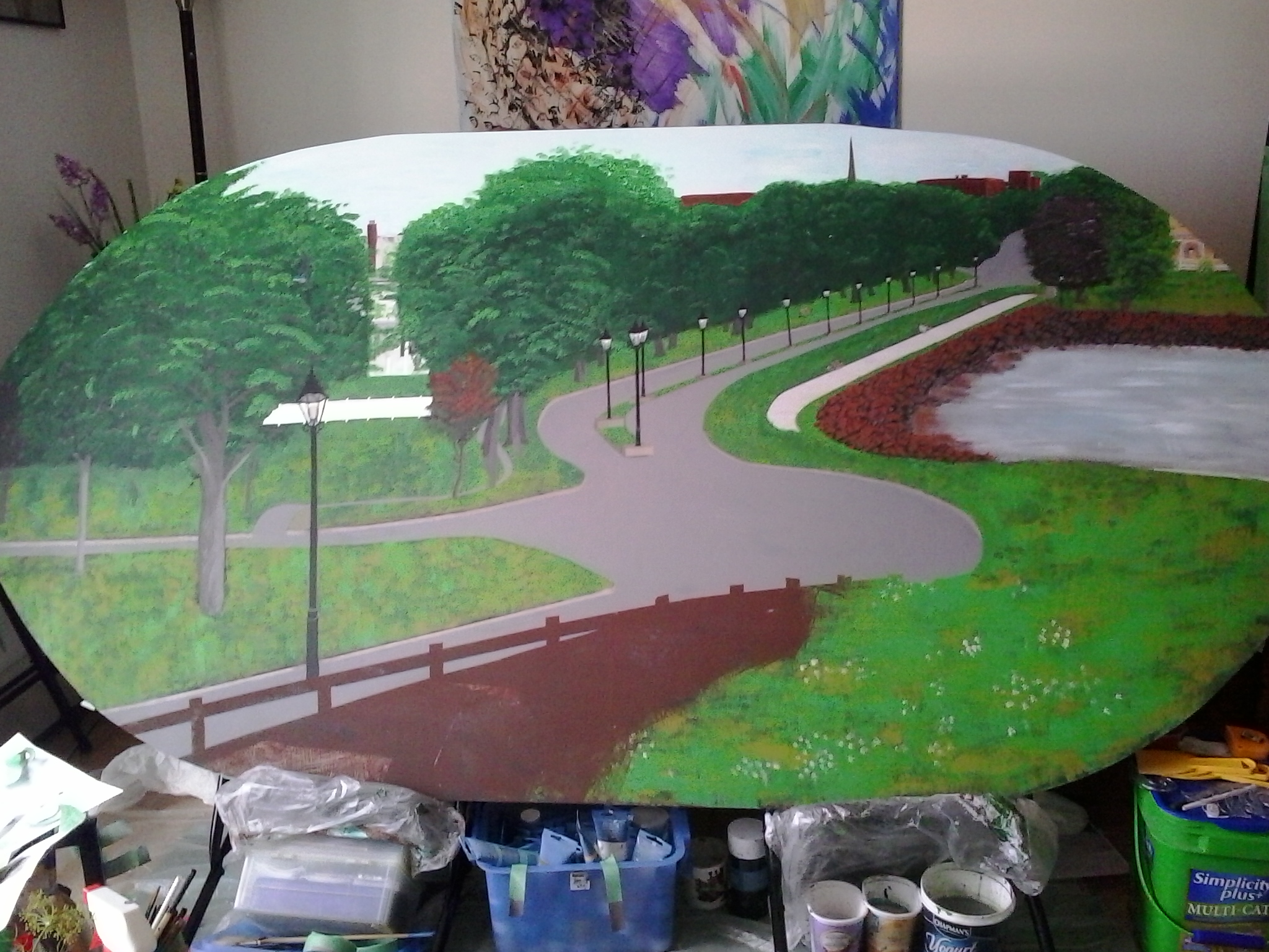
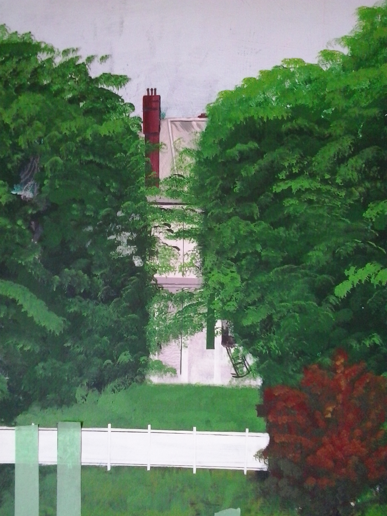
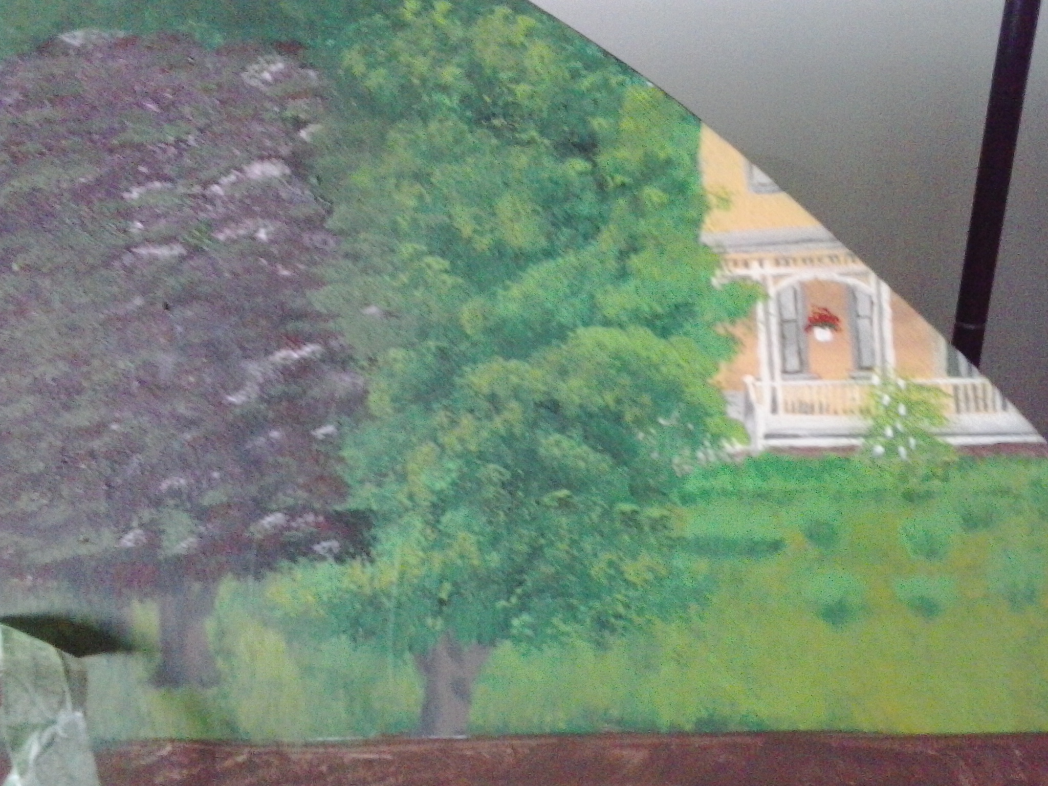
The first detail I completed was Beaconsfield House in the upper right hand corner.
the Lieutenant Governer’s Residence, Fanningbank,
which is visible between the trees from the park.
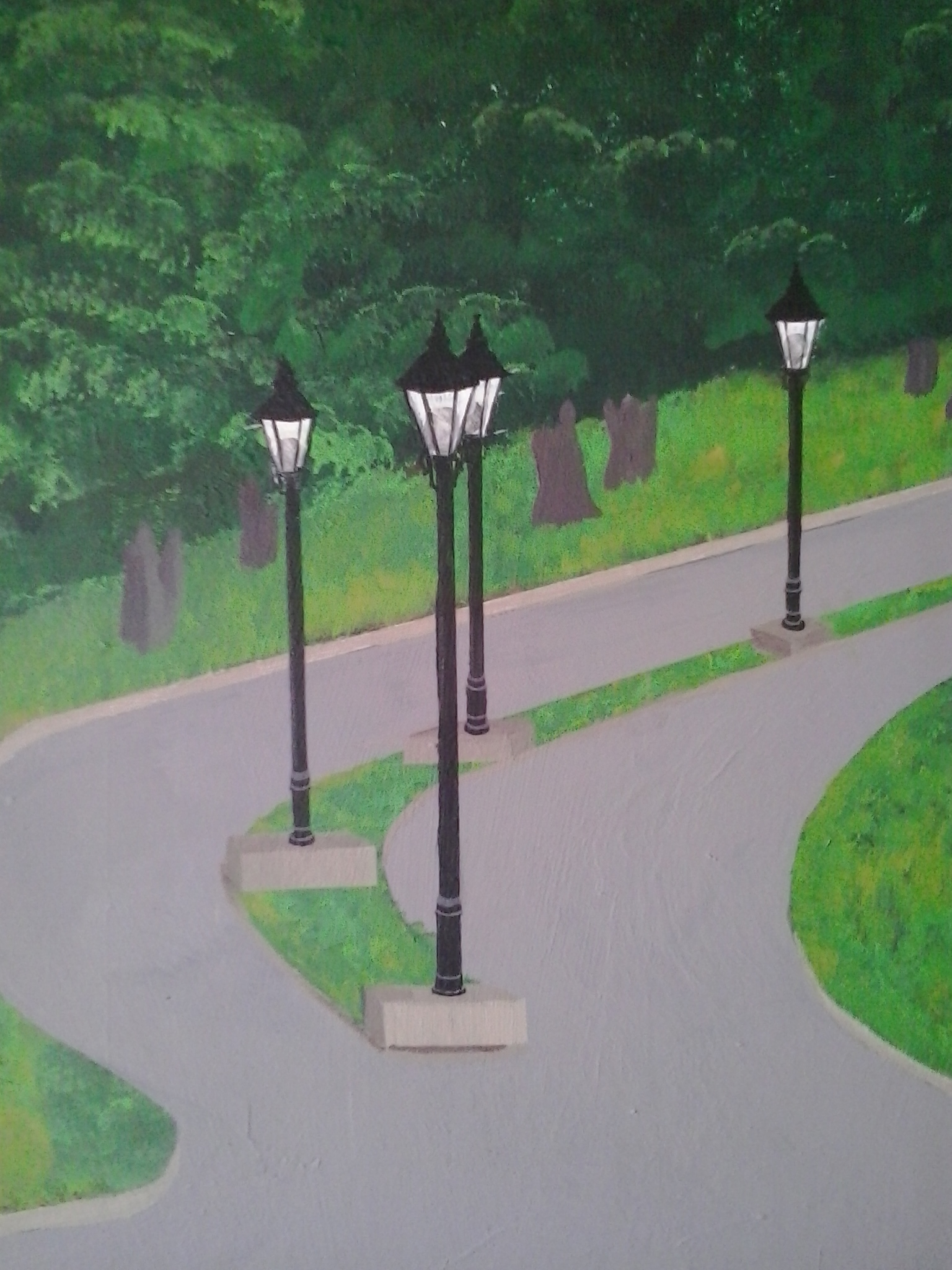
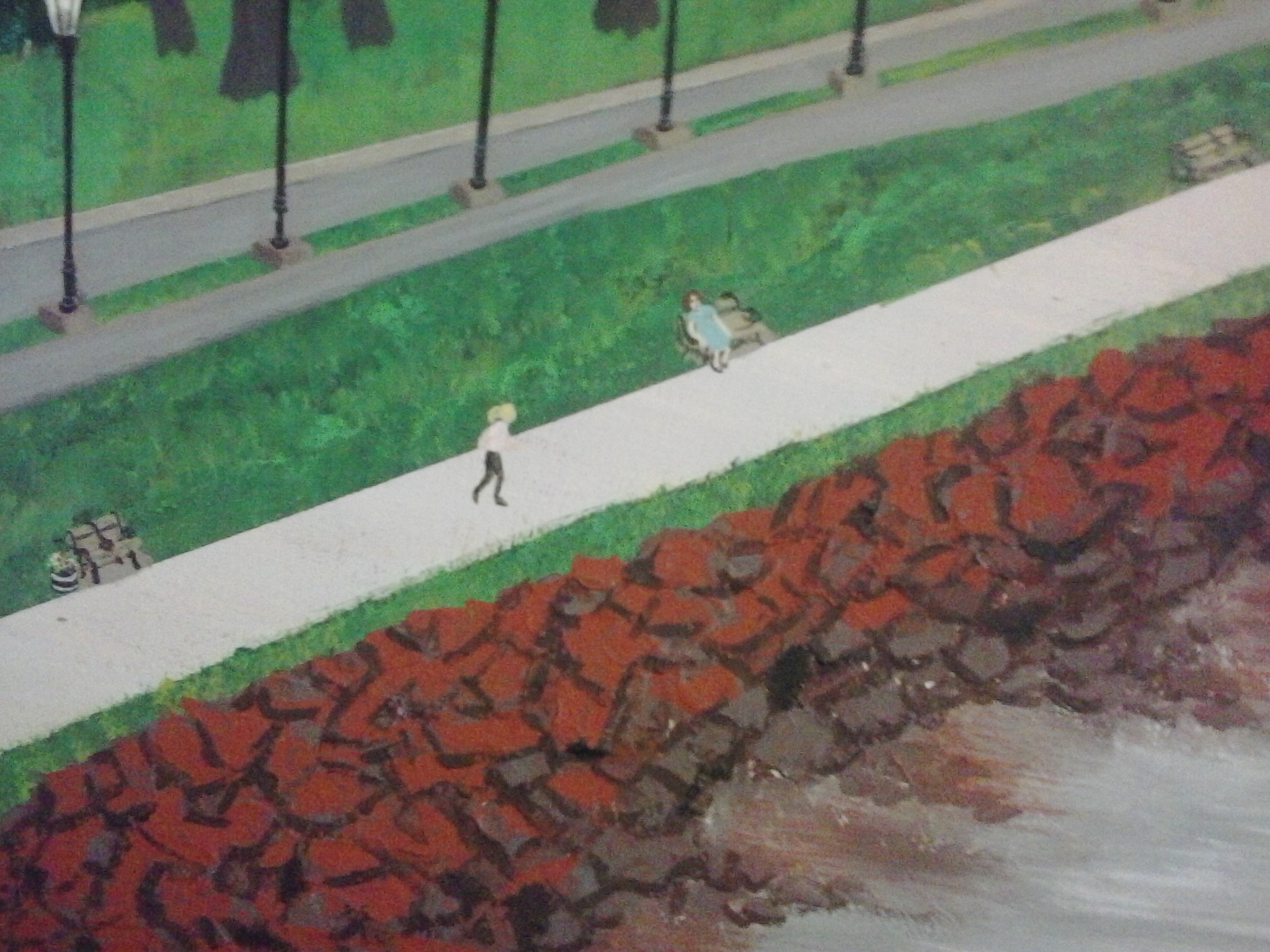
Next, I worked on the rocks around the shore of the Gulf of St. Lawrence, in the Bay that leads to the Charlottetown Harbour, also visible from the park. I added the lamps and detailed them.
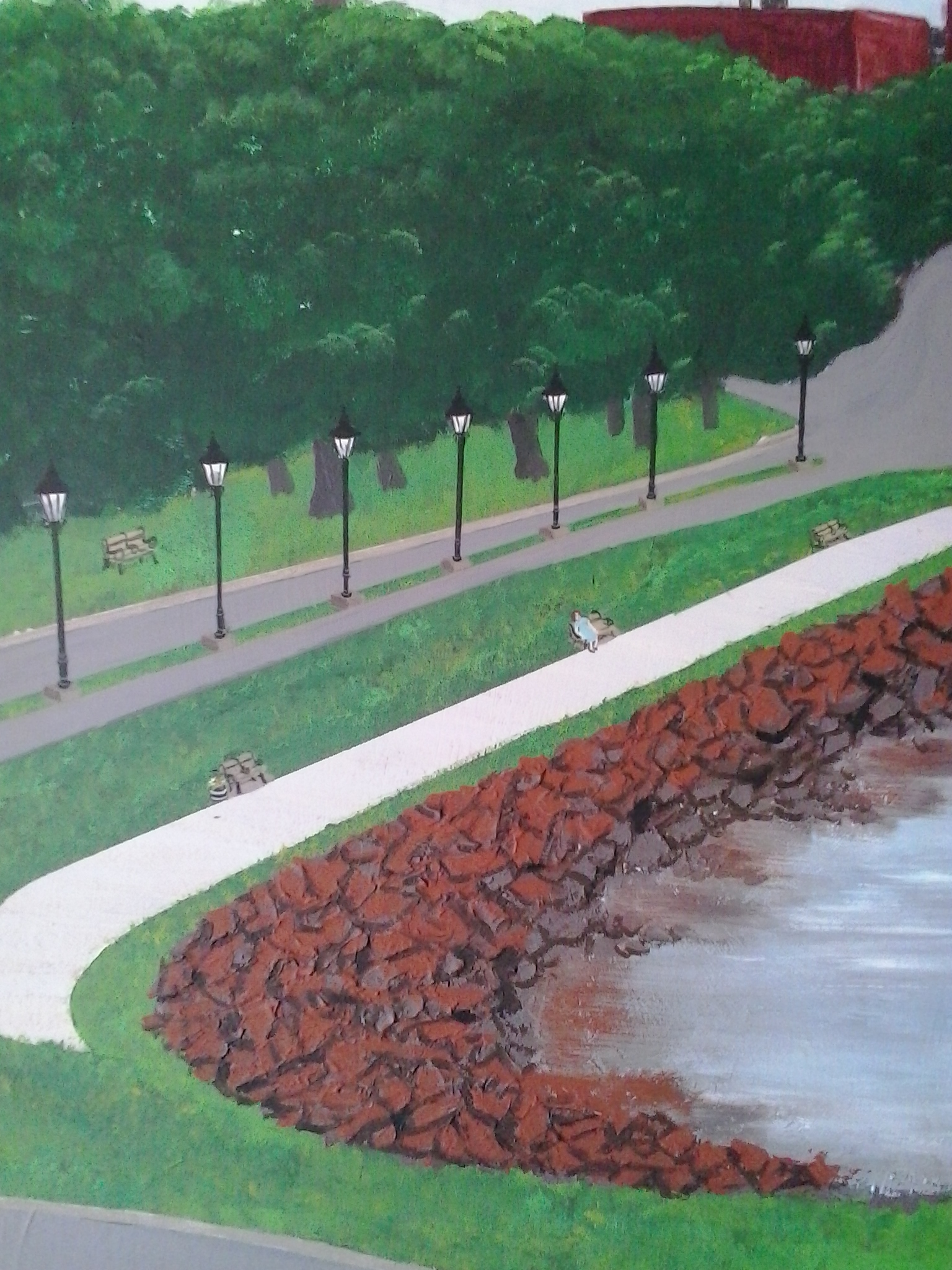
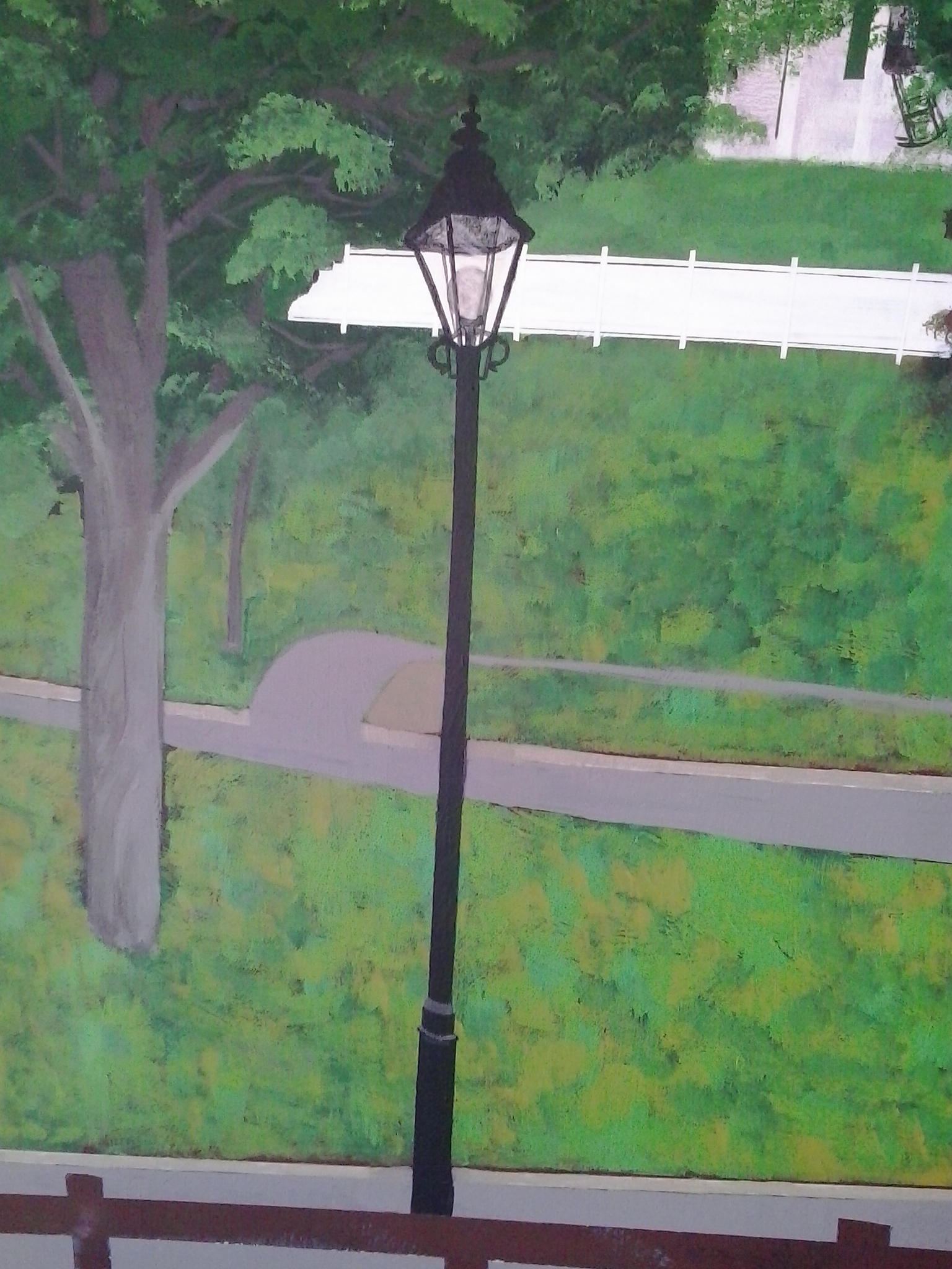
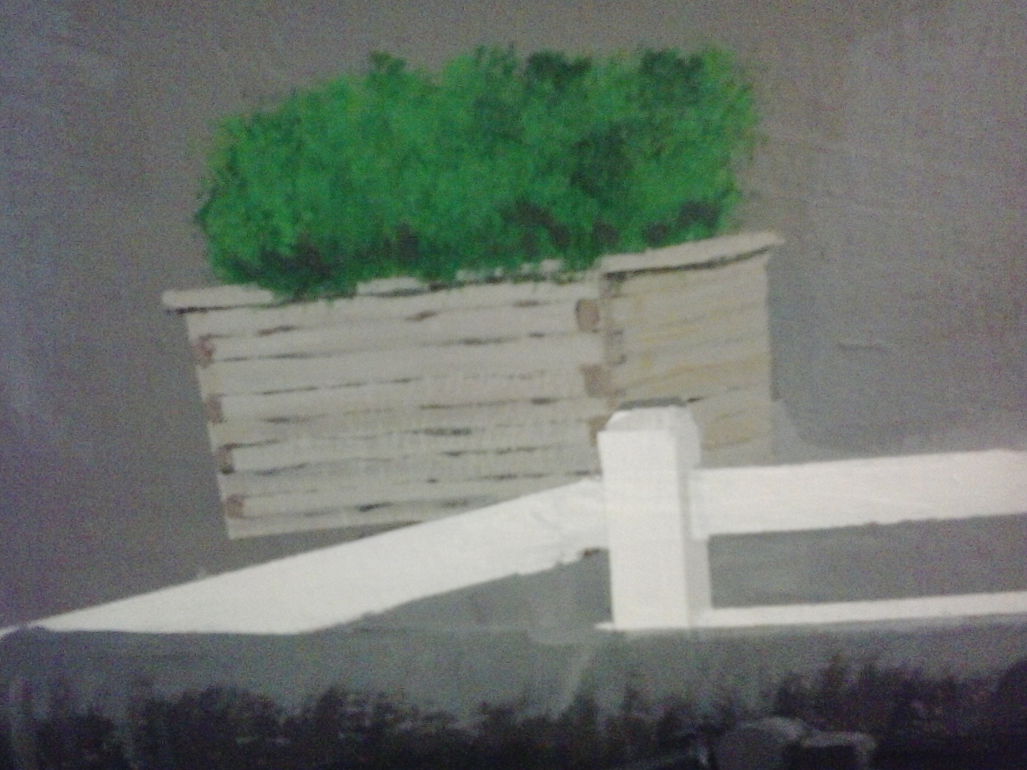
Then, I worked on the flower boxes and the planters. Each lamp had flowers at the base. I decided not to include the planters that were used during summer to divide the left lane in two so that there would be a bicycle lane, because it would make the road too crowded and the lanes too narrow.


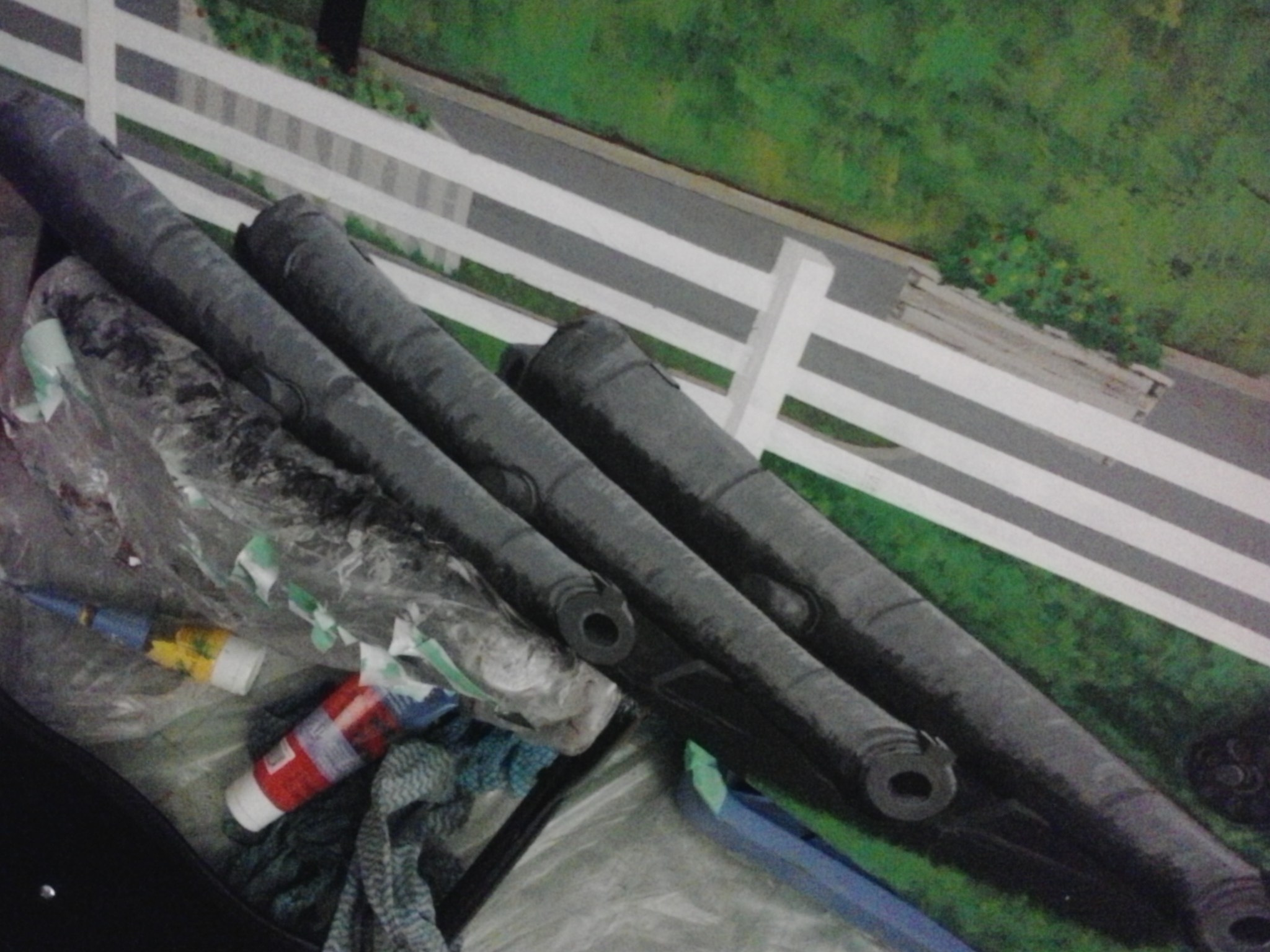
Then I started on the new cannons, much smaller and placed in the bottom third of the painting, instead of in the bottom half.
 I changed the proportions a bit, so they look longer and thinner up close, but fit nicely in the bottom; I also changed some of the proportions of the fence so I could fit the cannons into the bottom third, so you get more of a view from up looking down.


After the cannons, I added more details to the boardwalk–worked on the park benches and a seated woman. Then, when my friends Veronika and her daughter Viola were with me painting as well, I added a jogger so Viola would have her mom in the painting!
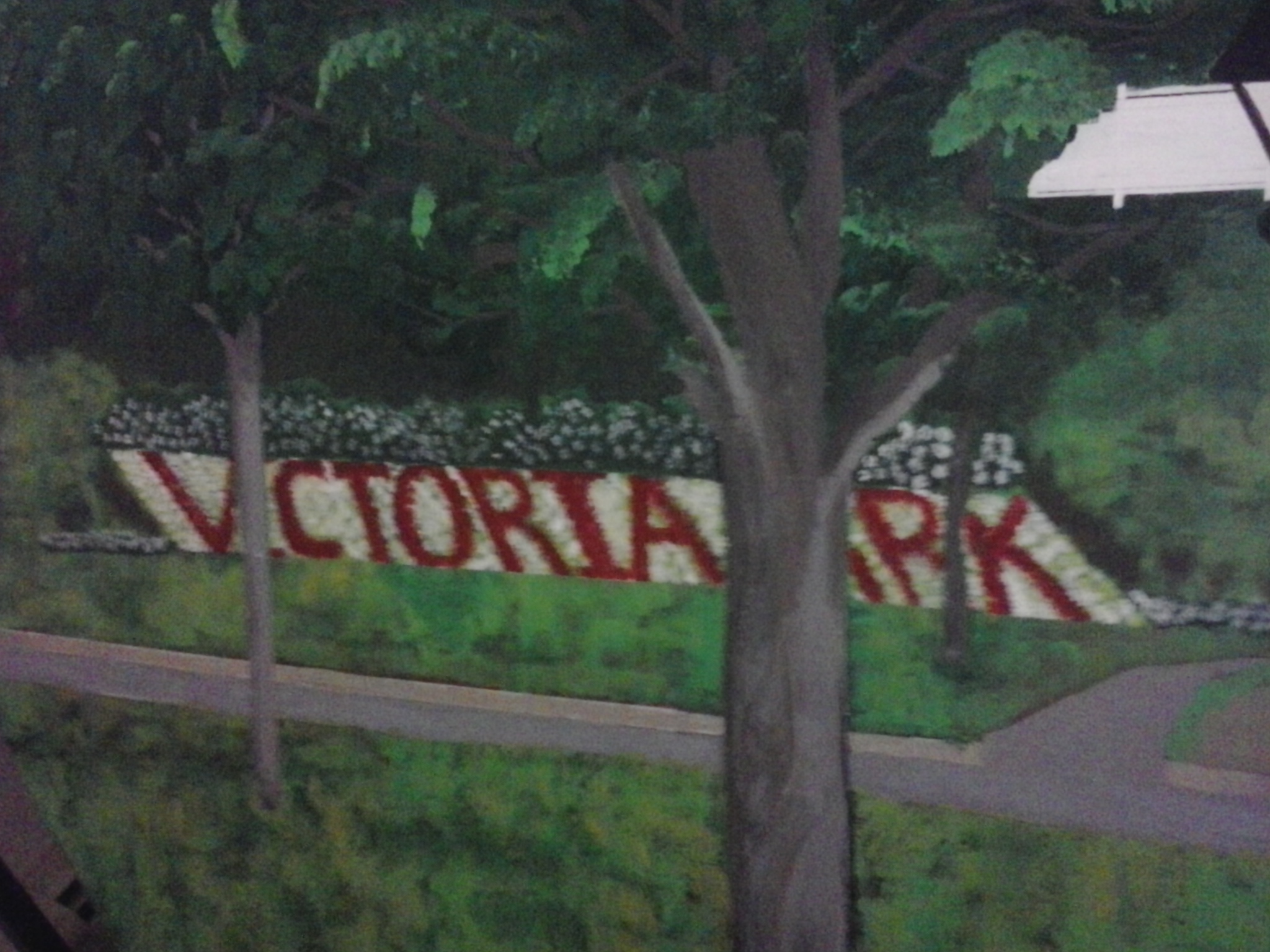
The first time I did the lettering for Victoria Park in flowers, it was too upright, so I re-did that.

Then, I did the viewing platform, added plants and flowers to the lamp post bases…

This is the blurry shot of the viewing platform in the making, but clearer than the first one I took…
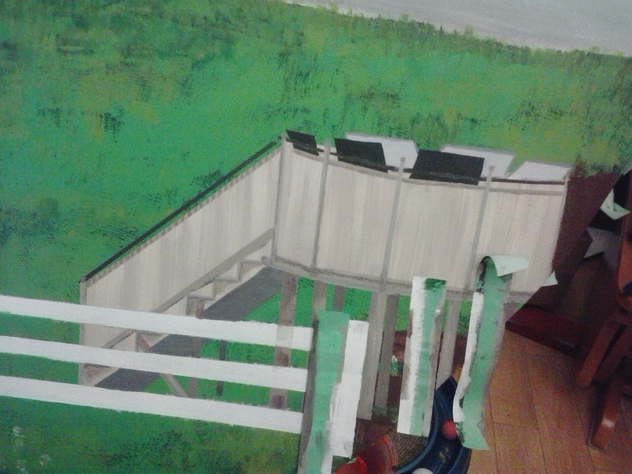
This is the clearest shot of the three I took of the viewing platform in progress…
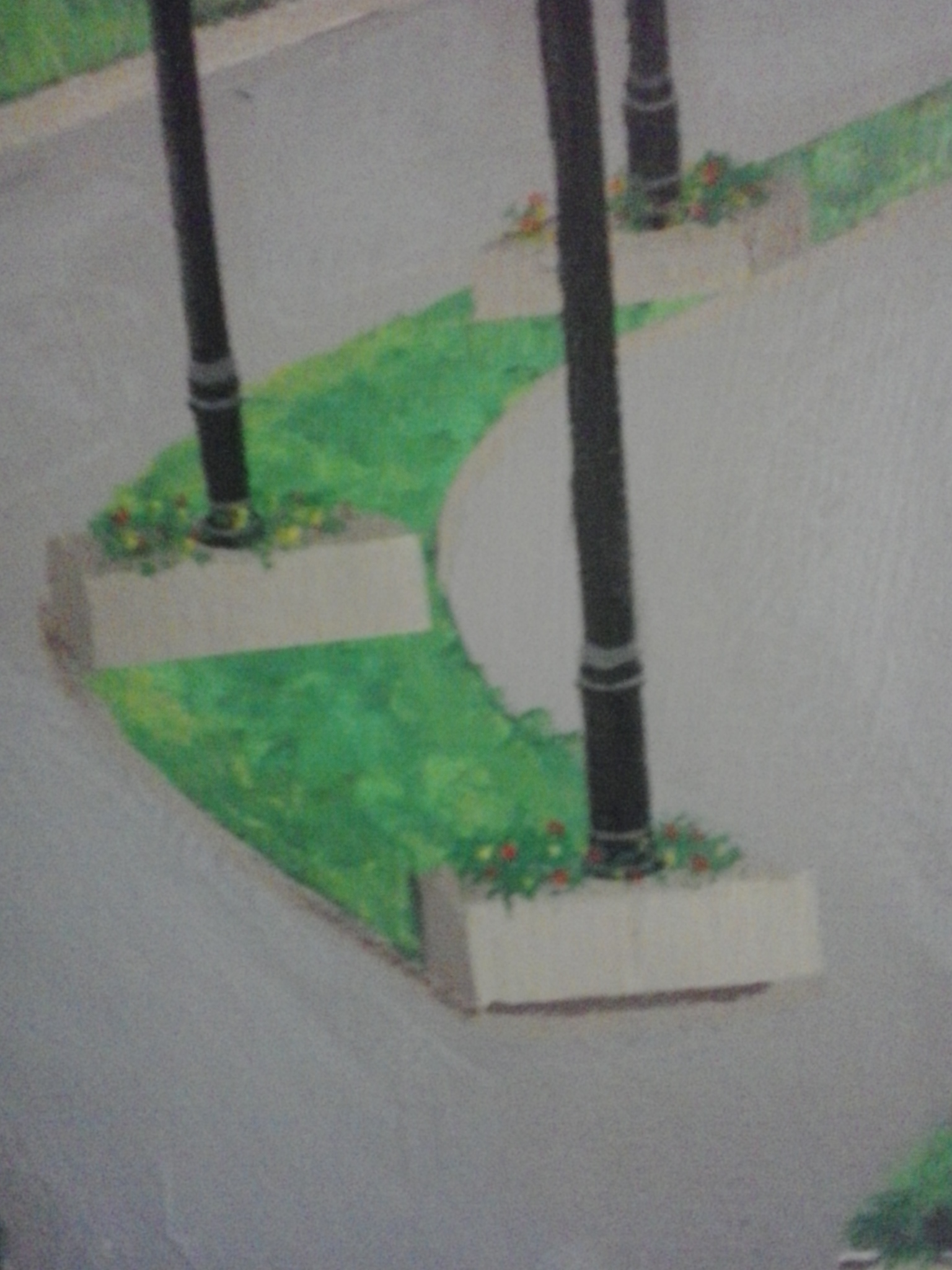
Added plants and flowers to the bases of the lamp posts…
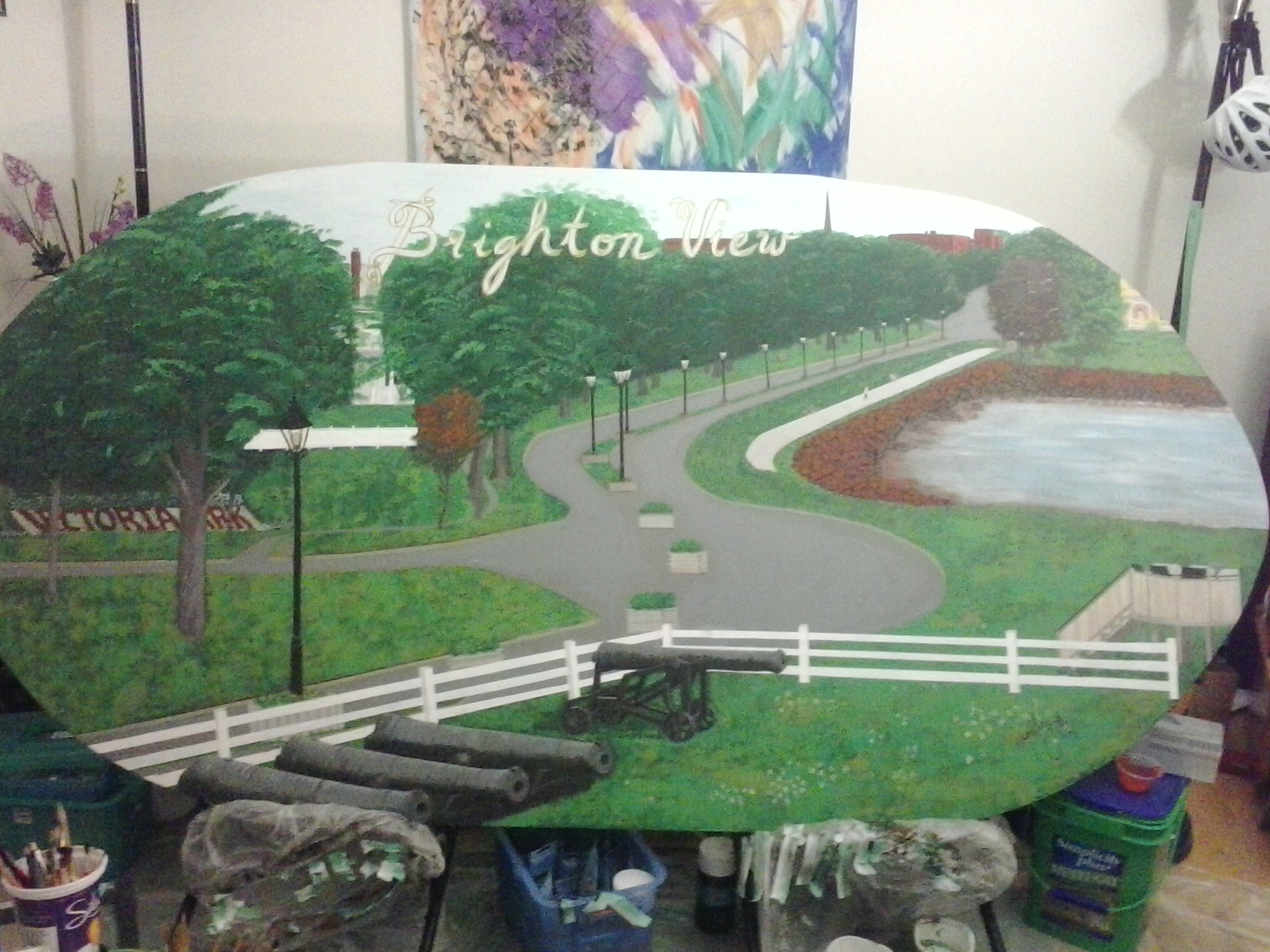
And one day, it was just done. I roughed up the water a little, broke up some of the rocks, then let it sit for a couple of days before spraying a finishing coat.
I let it sit again for a couple of days before I decided how to do the lettering in parchment with gold outlining.
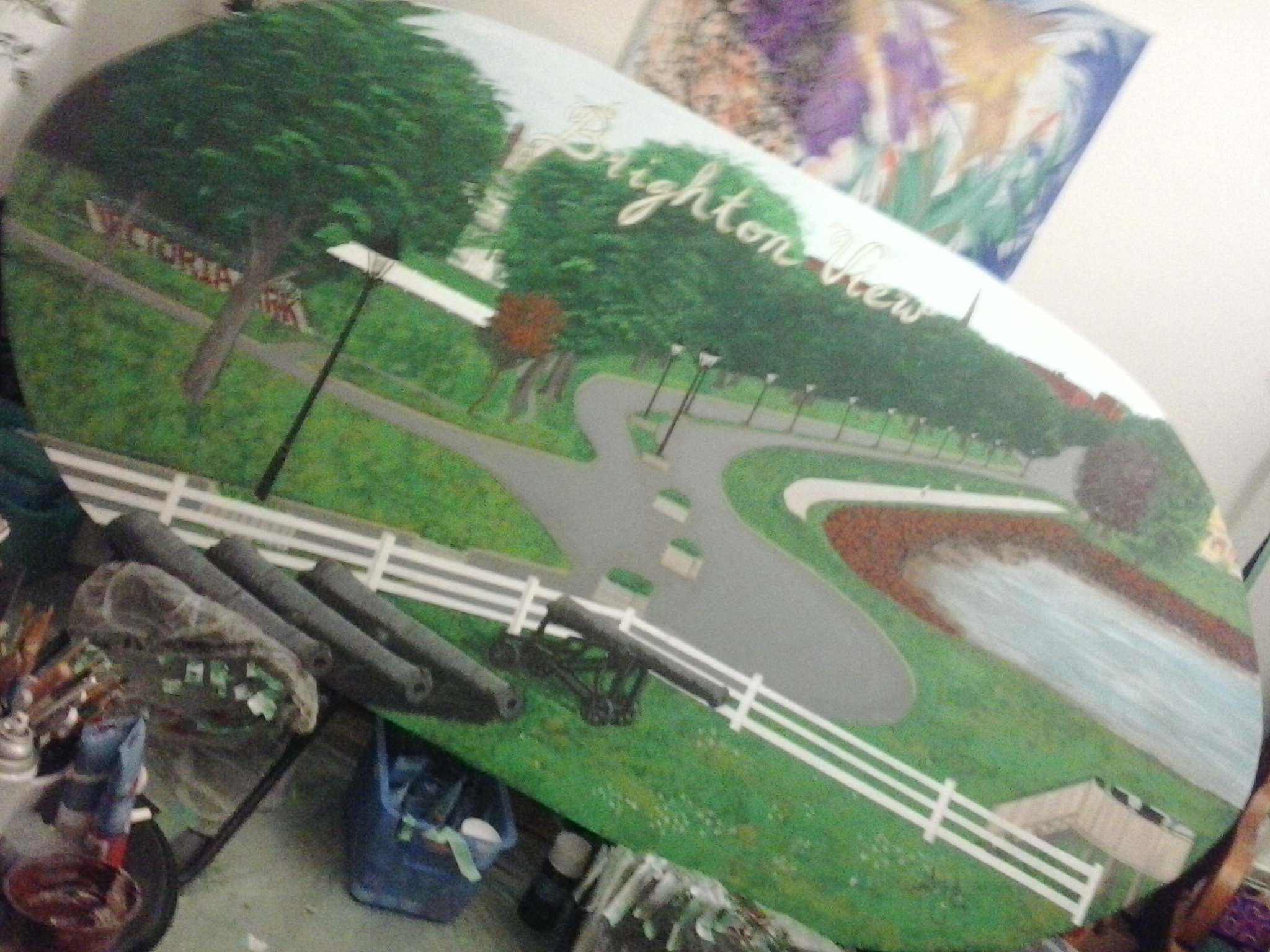
Tried to get a diagonal shot to get the whole painting into my phone view with the biggest possible shot.
The whole painting is too large to take a close-up of, so I had to pull back halfway across the living room to take a full-width view. The actual shape is elliptical…
Not enough back-up room. Hehe. It gets cropped on one side.
… and this is what it would look like if it were cropped into a perfect oval shape (which just didn’t happen when Peter was cutting it up with his jigsaw. If the clients want to trim the corners, that’s perfectly all right with me, but I deliberately made a wider ellipse to get as much painting surface as possible.
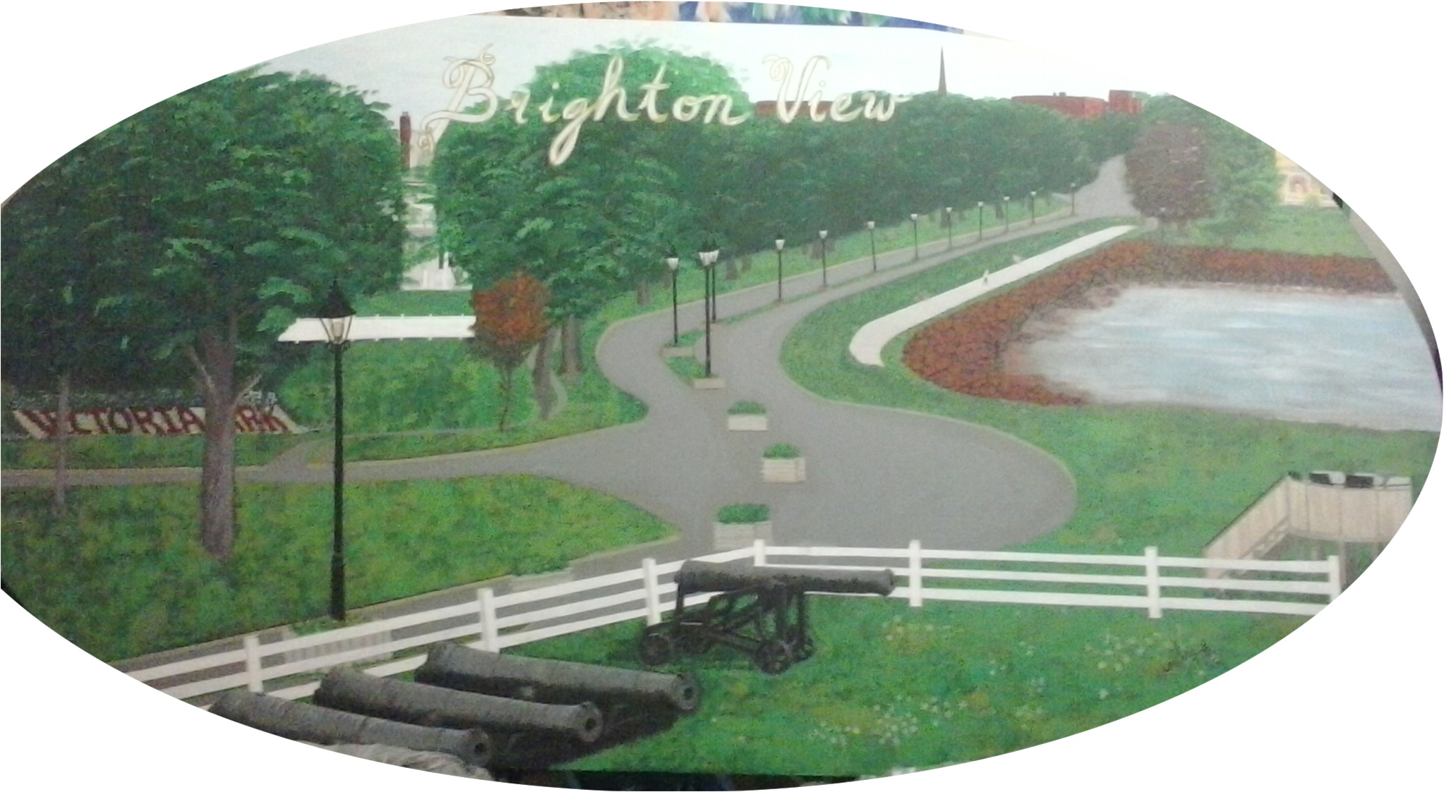
The Brighton View Landscape can be viewed at the Garden Home, North River Road, Charlottetown, along with my mural of the old farmhouse. I need to take a photo of this with a real camera with proper lighting.
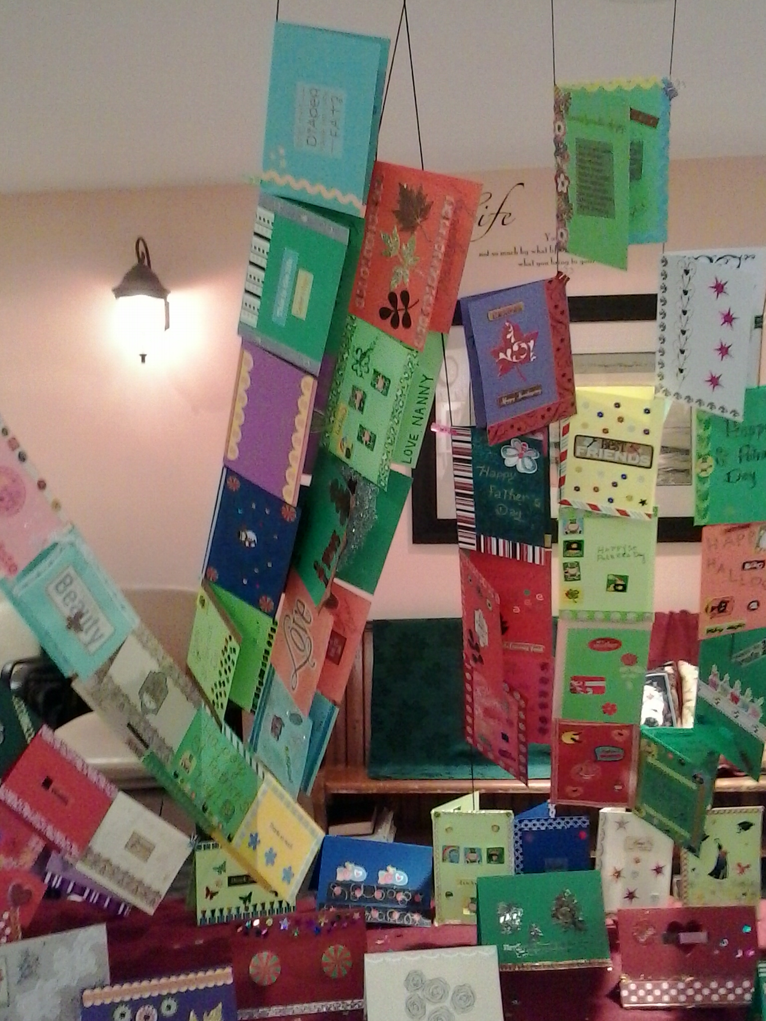
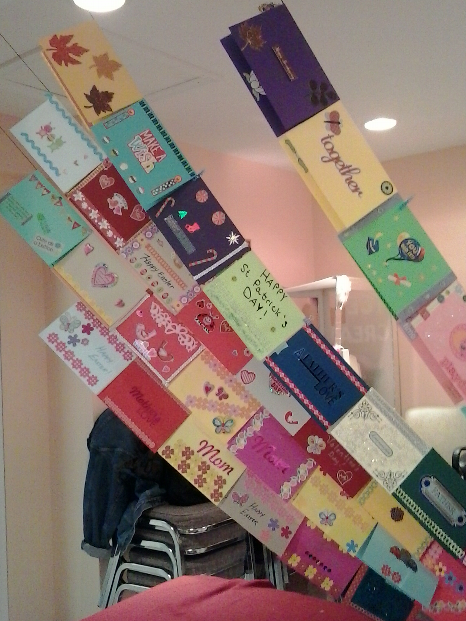
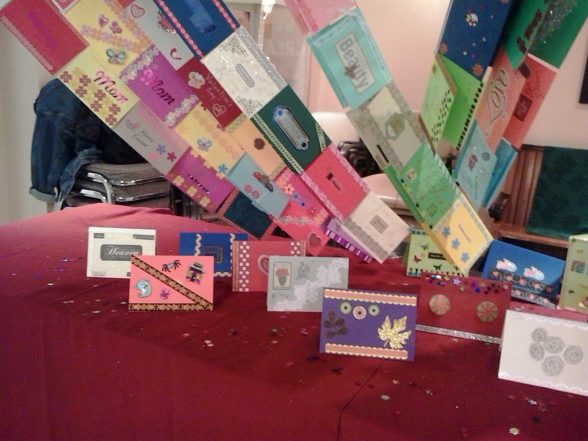
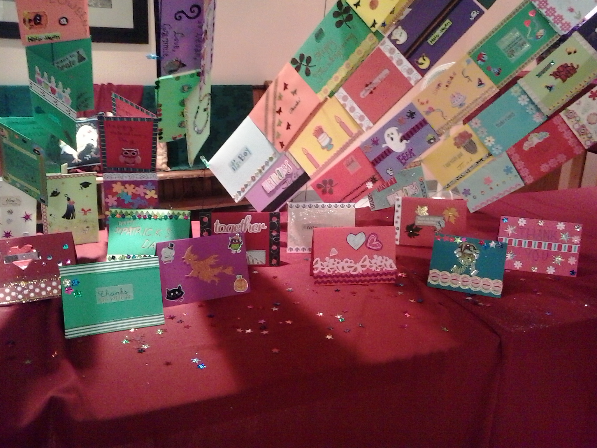
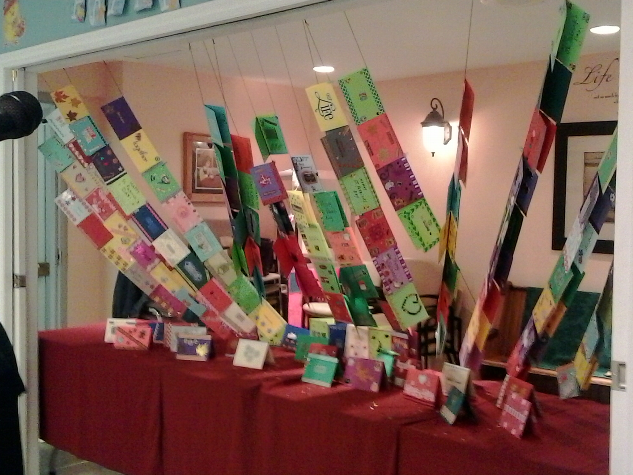
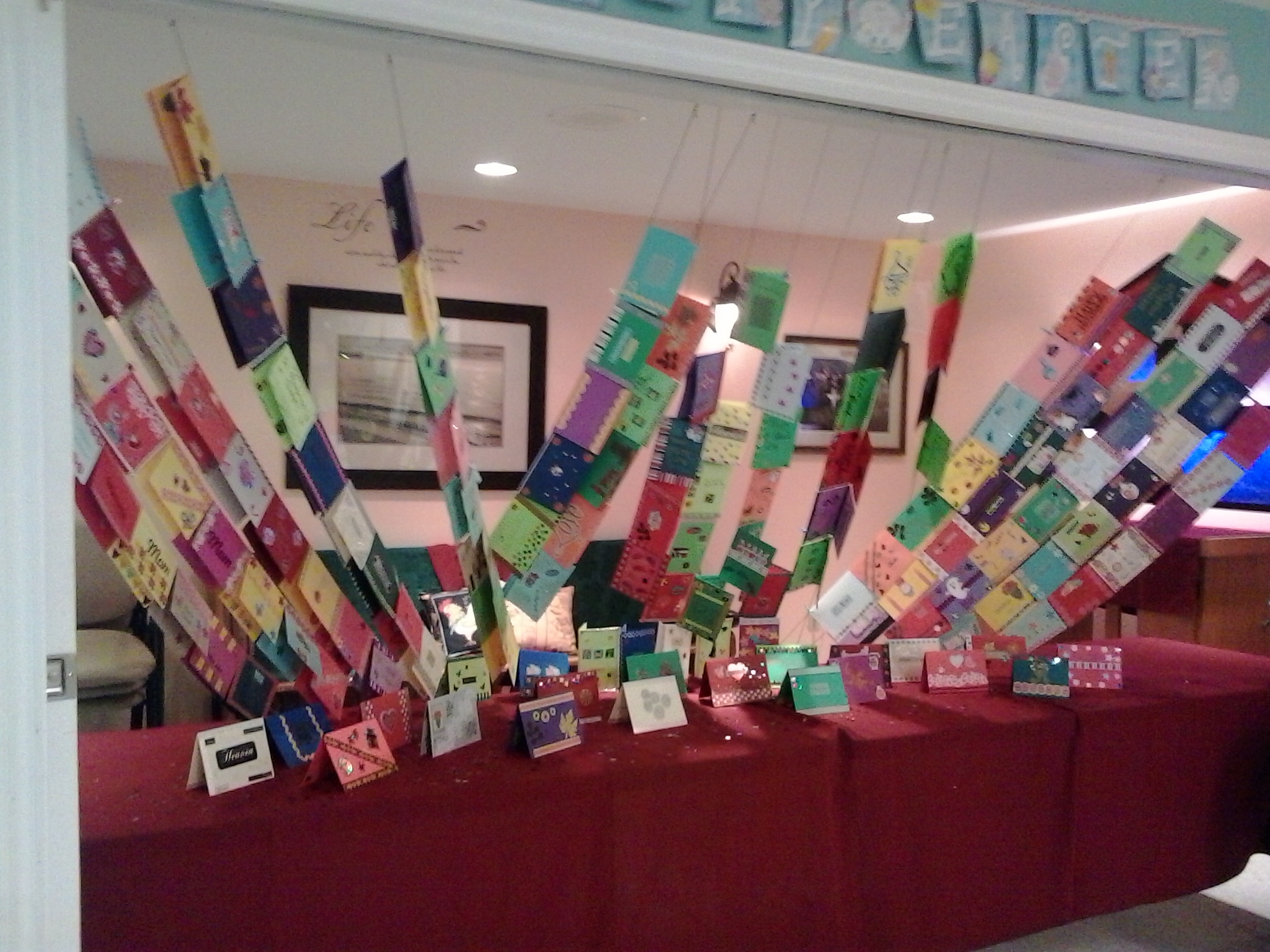
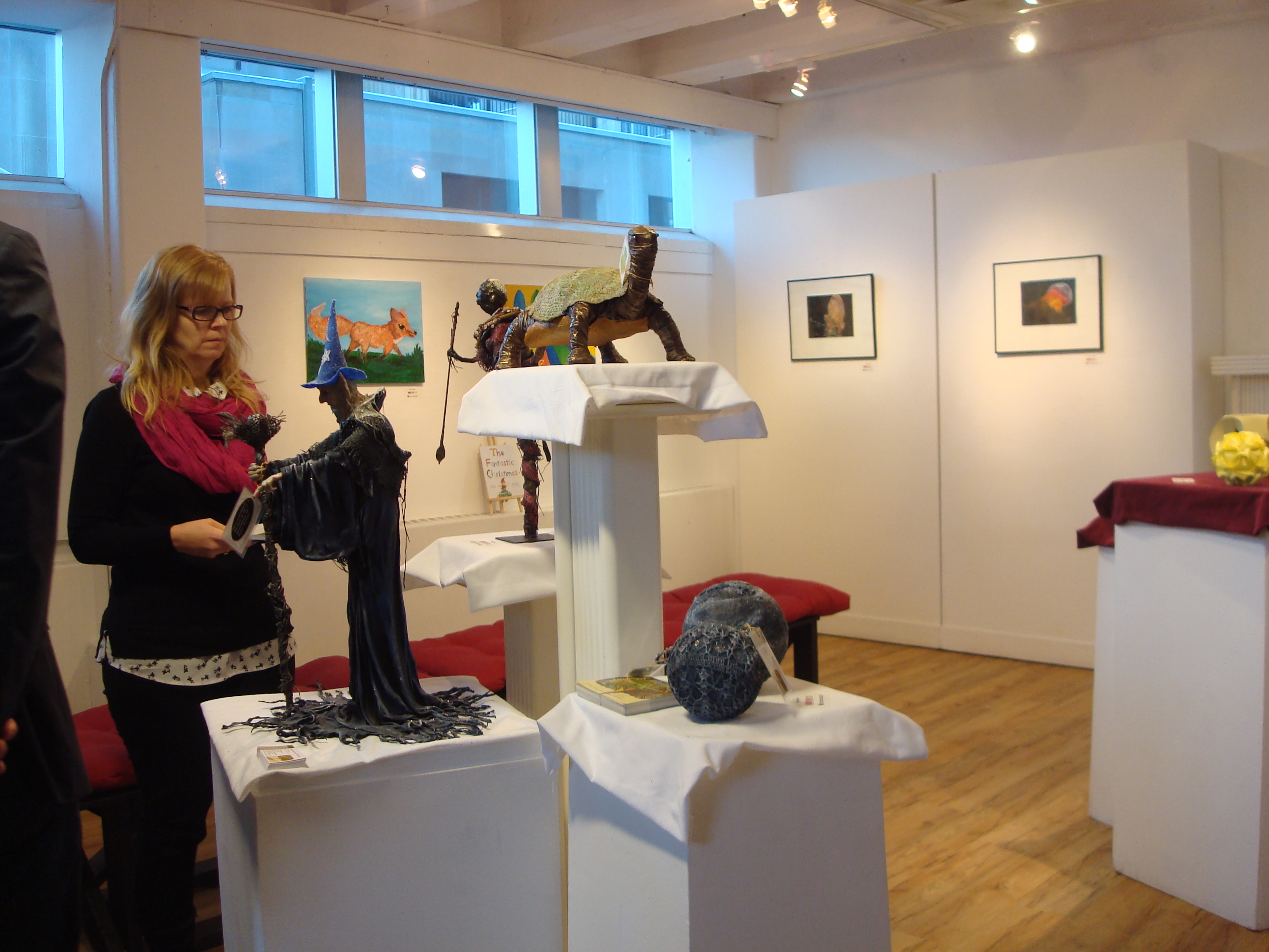
Festive display of greeting cards made by senior participants in the Garden Home’s 2014 L.E.A.P. (Learning Elders Art Program) under the auspices of the PEI Senior Citizens’ Federation through funding from the PEI Department of Tourism and Culture, in cooperation with the PEI Council of the Arts.
The participants (14 regular) attended 12 weekly sessions to create 12 cards for 12 occasions.
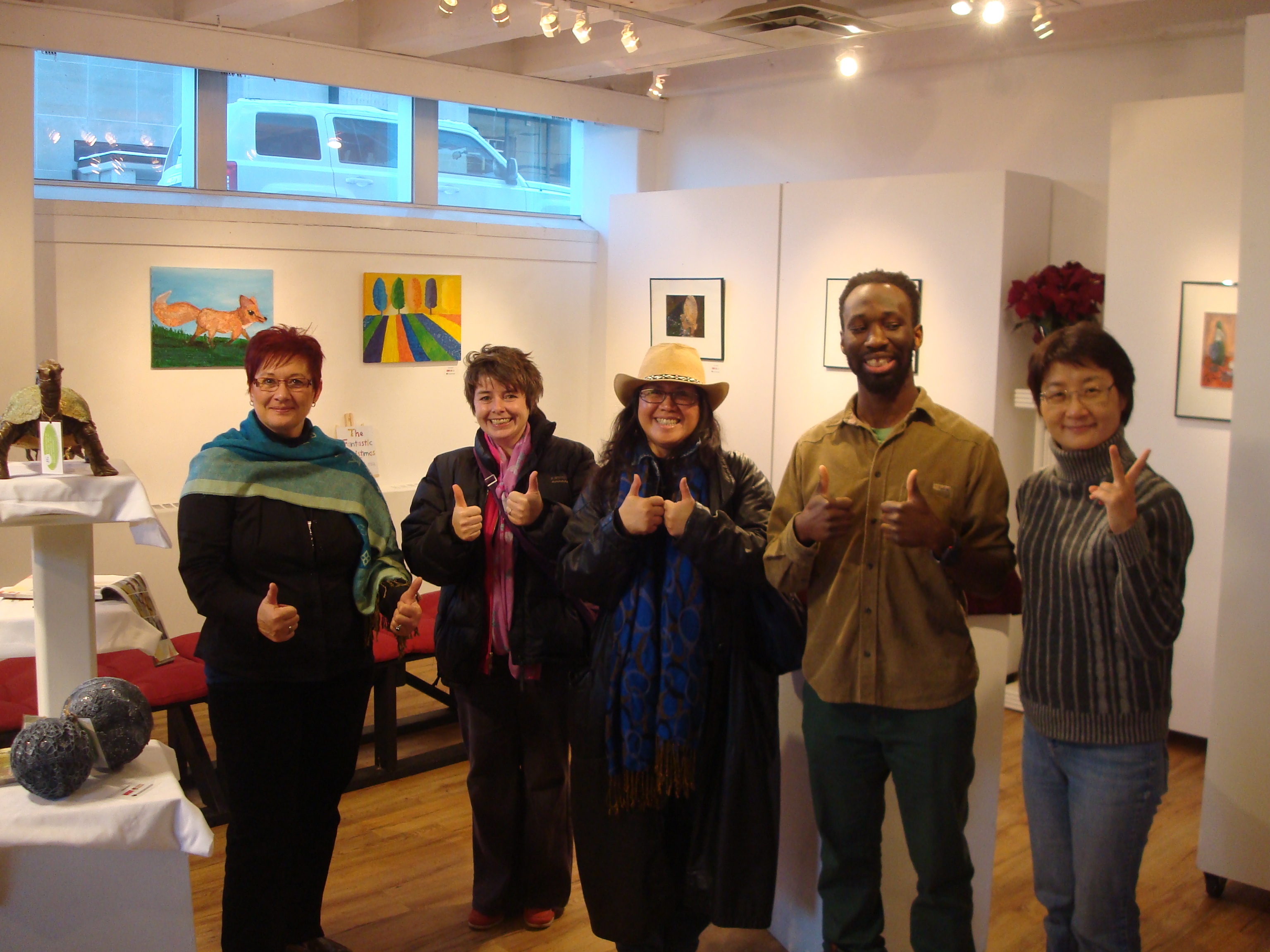
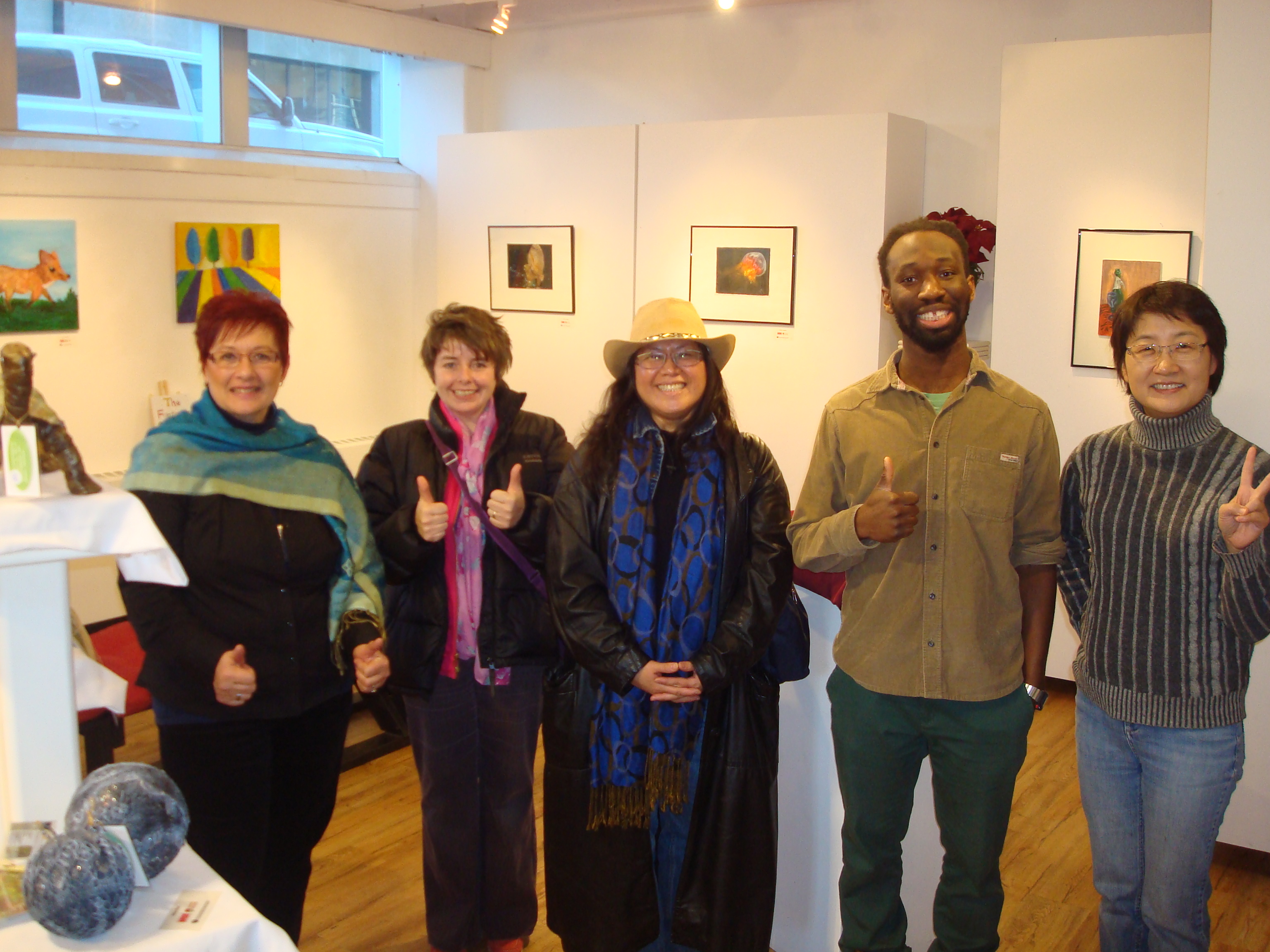
The cards were displayed at an Open House Exhibit, where MLA Kathleen Casey handed out Certificates of Completion to the participants. Also in attendance was PEI Senior Citizens’ Federation Director Bill Oulton.
The experience was thoroughly enjoyable for the participants, as well as for myself! I would do participate in the LEAP program over and over again!
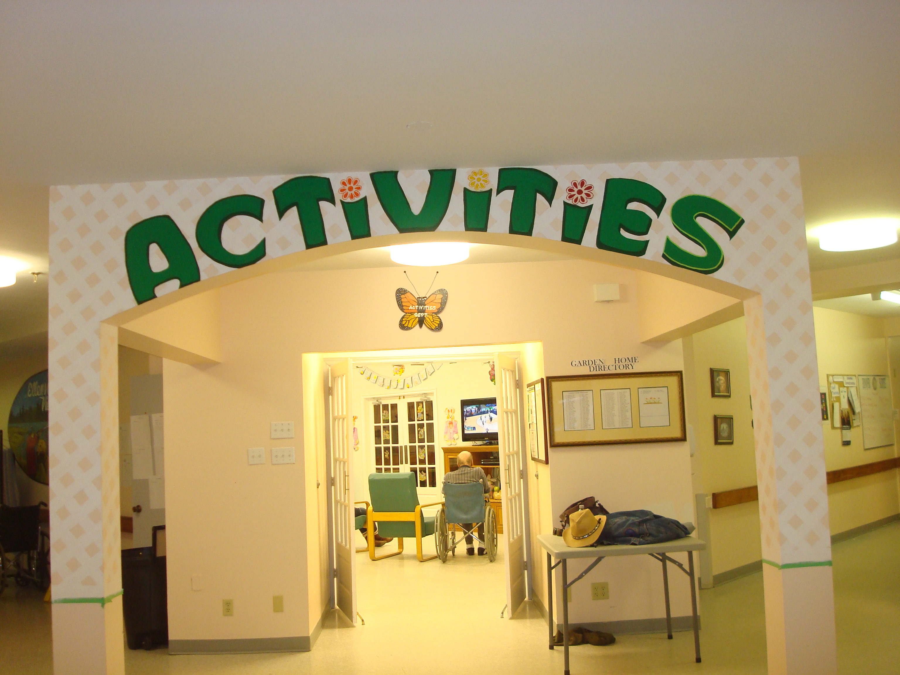
(The Garden Home is located on North River Road in Charlottetown)


Return to Crafts & Kitchen
Youth/Teen
5-day summer camps for youth (8-12) and teens (13-18); grown-ups also welcome!
Choose from 2 class schedules each week: morning classes (9:30-12:00) OR afternoon classes (1:30-4:00)
Art (visual arts: pencil, charcoal, ink, pastels, watercolour, acrylic, oil, mixed media)
Writing (creative writing)
Speech (public speaking, dramatic delivery)
A different camp each week beginning in June 2014 at the Murphy Community Centre.
For more information and reservations, visit Art ‘n’ Words Studio and Gallery.
*****
Open Courses
Weekly after-work sessions for adults at the Murphy Community Centre:
Art Mondays (visual arts: pencil, charcoal, ink, pastels, watercolour, acrylic, oil, mixed media)
Writing Wednesdays (creative writing, research & report writing, business communication)
Speaking Fridays (public speaking, speech improvement, business communication, dramatic delivery)
All sessions run from 6:30-8:30 p.m.
For more information and reservations, visit Art ‘n’ Words Studio and Gallery.

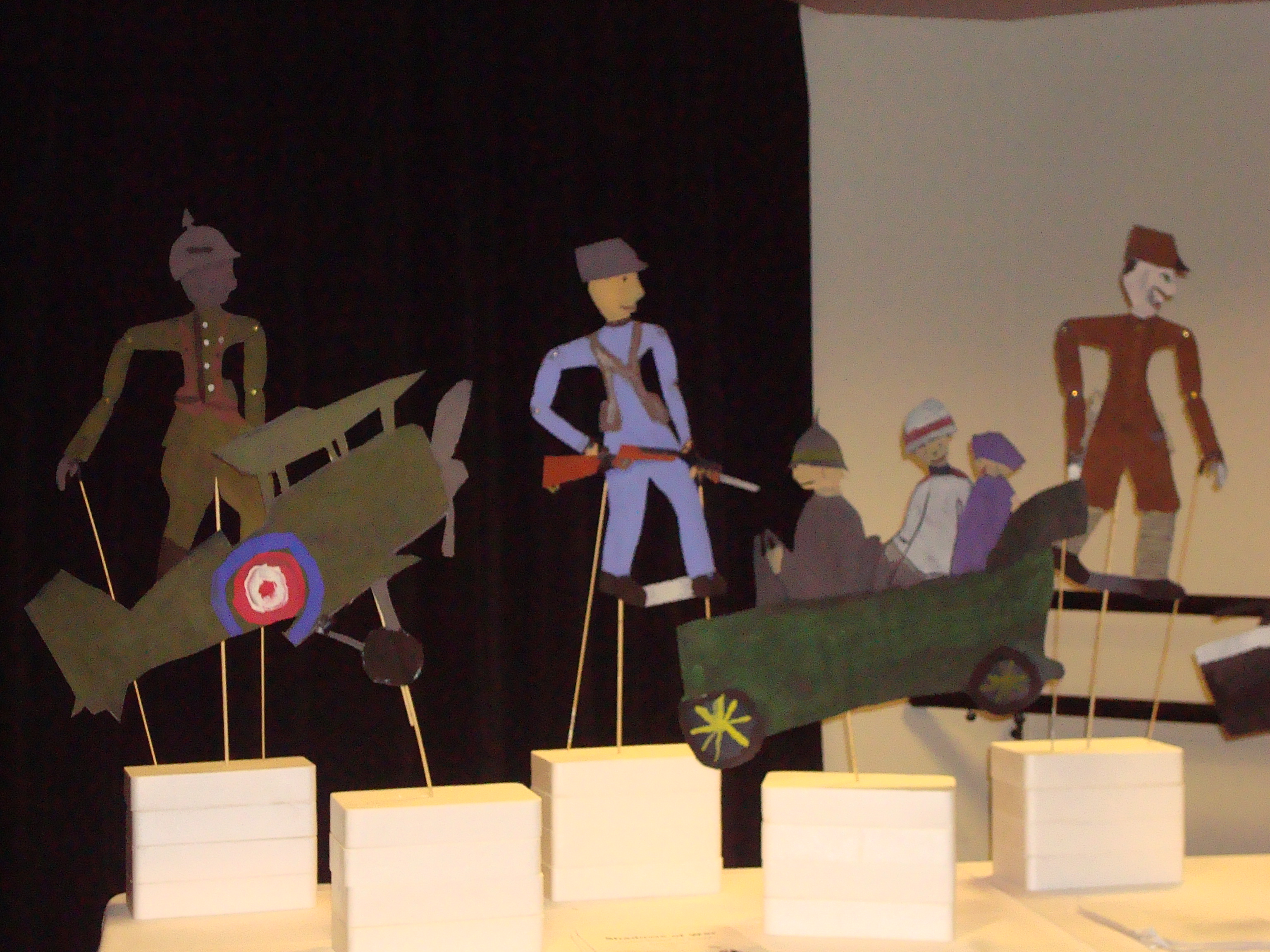
For the first time, I had the opportunity to join Culture PEI’s ArtSmarts program, and I must say it was an experience to remember!
This year, the program was organized in collaboration with the PEI Association for Newcomers and Sandy Macaulay’s Project-Based Learning class of pre-service B.Ed. students to fulfill the theme “Celebrating Diversity: Exploring Culture, Language, Identity and Global Citizenship.”


